Demographics
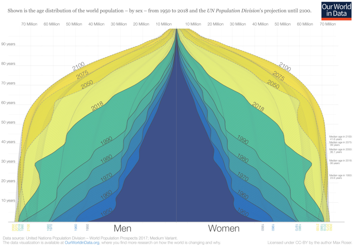
The World Population Pyramid (1950-2100)
Article/Editing:
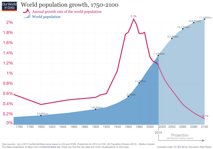
The world is in the midst of a notable period of demographic transition.
Back in the 1960s, global population growth peaked at a 2.1% annual rate, but since then it has been on a historic downtrend.
In fact, according to the most commonly cited United Nations projection, which is based on a medium fertility rate scenario, it’s expected that annual population growth could drop all the way to 0.1% by the end of the 21st century.
Visualizing a Demographic Transition
Today’s powerful charts come from Our World in Data by economist Max Roser, and they show how global demographics will shift over the next 80 years.
Below you can see one major catalyst of this change, which is the peaking (and then falling) population growth rate:
Why has population growth been dropping since the 1960s?
A variety of explanations factor into this, including:
- Falling fertility rates:
Birth rates tend to fall as nations get richer. First, this happened in the developed world, but as the century progresses this phenomenon will impact more and more developing nations. - Government policy:
China’s “One Child Policy” in particular had an effect on global population growth, and the aftermath of the policy is still contributing to a shrinking Chinese population over the long term. - Rural flight
Urban dwellers tend to have fewer babies—and by 2050, there will be an additional 2.5 billion people living in cities globally.
Fewer births combined with improving healthcare—especially in developing nations—will dramatically alter the composition of the world population pyramid, creating both economic opportunities and challenges in the process.
The Changing World Population Pyramid
The following graphic charts how these changes affect the makeup of the world’s population.
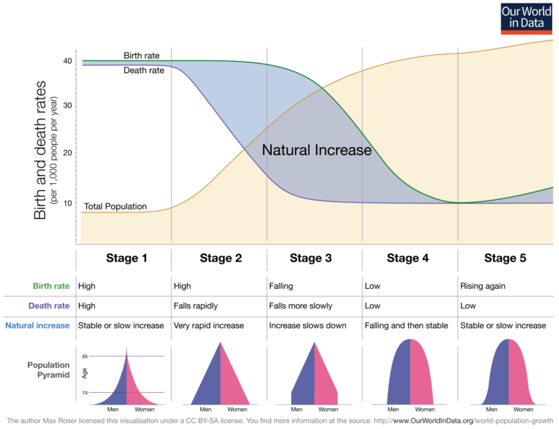
Over time, the shape of the world population pyramid is expected to shift from Stage 1 (high birth rates, high death rates) to something closer to Stage 4 (low birth rates, low death rates).
As the population distribution skews older, here is how population size and global median age will change:
| Year | Global Population Size | Median Age |
|---|---|---|
| 1950 | 2.6 billion | 23.6 years |
| 2018 | 7.6 billion | 30.0 years |
| 2050p | 9.7 billion | 36.1 years |
| 2075p | 10.7 billion | 39.0 years |
| 2100p | 11.2 billion | 41.6 years |
Global median age is projected to surpass 40 years by the end of the century, and it will be considerably higher in many Western nations, especially in Japan and Europe.
With the future demographic composition looking very different than today, it will be fascinating to see how the economy responds to these potential tailwinds. Further, it will be even more interesting to see what role automation will play as the old-age dependency ratio hits historic highs.

This article was published as a part of Visual Capitalist's Creator Program, which features data-driven visuals from some of our favorite Creators around the world.


Demographics
Mapped: U.S. Immigrants by Region
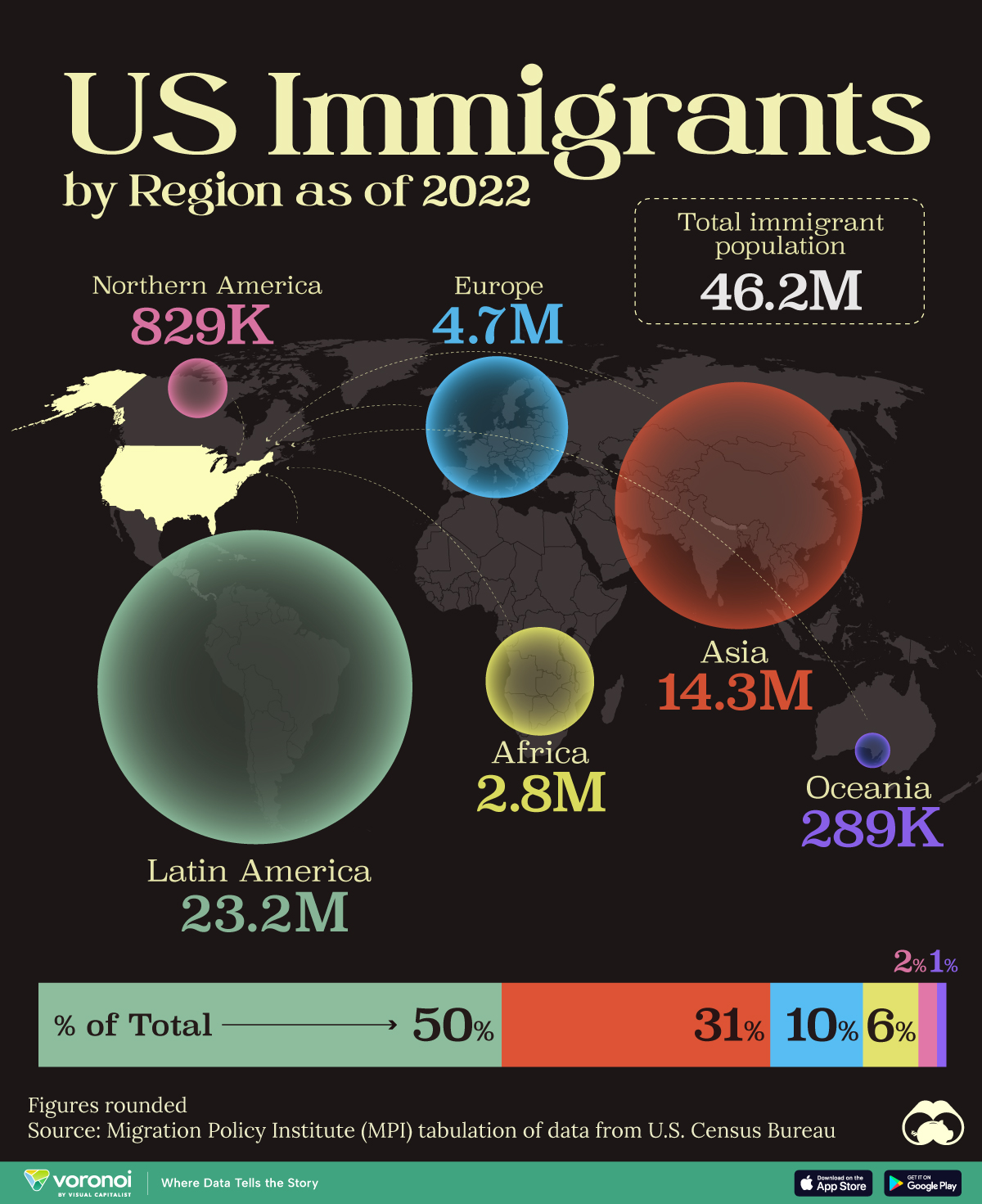
This map shows which regions U.S. immigrants came from, highlighting Asia and Latin America as the biggest sources.
Breaking Down America’s Immigrant Population
This was originally posted on our Voronoi app. Download the app for free on iOS or Android and discover incredible data-driven charts from a variety of trusted sources.
The United States is home to more immigrants than any other nation, surpassing the combined totals of the next four countries: Germany, Saudi Arabia, Russia, and the United Kingdom.
To add context to this impressive fact, we’ve illustrated the regions from which U.S. immigrants originated. “Immigrants” in this context refers to individuals who are residing in the United States but were not U.S. citizens at birth.
These statistics were sourced from the Migration Policy Institute, which analyzed data from the U.S. Census Bureau’s 2022 American Community Survey (ACS).
U.S. Immigrants by Region
From this graphic, we can see that Asia and Latin America emerge as the primary sources of immigration, collectively accounting for 81% of America’s 46.2 million immigrants.
| Region | # of Immigrants | % of Total |
|---|---|---|
| Europe | 4,728,948 | 10 |
| Asia | 14,349,080 | 31 |
| Africa | 2,752,965 | 6 |
| Oceania | 288,560 | 1 |
| Northern America | 828,702 | 2 |
| Latin America | 23,233,834 | 50 |
| Total | 46,182,089 | 100 |
Latin America alone contributes half of the immigrant population. Mexico stands out as the largest contributor to U.S. immigration, with 10.7 million immigrants, attributable to its geographical proximity and historical ties.
Economic factors, including wage disparity and employment opportunities, drive many Mexicans to seek better prospects north of the border.
From Asia, the two largest country sources are China (2.2 million) and India (2.8 million).
Learn More About U.S. Immigration From Visual Capitalist
If you enjoyed this post, be sure to check out Why Do People Immigrate to the U.S.? This visualization shows the different reasons why immigrants chose to come to America in 2021.

-

 Markets6 days ago
Mapped: Europe’s GDP Per Capita, by Country
-

 Energy2 weeks ago
Mapped: The Age of Energy Projects in Interconnection Queues, by State
-

 Mining2 weeks ago
Visualizing Global Gold Production in 2023
-

 Markets2 weeks ago
Visualized: Interest Rate Forecasts for Advanced Economies
-

 Economy2 weeks ago
The Most Valuable Companies in Major EU Economies
-
 Markets1 week ago
The World’s Fastest Growing Emerging Markets (2024-2029 Forecast)
-
 Markets1 week ago
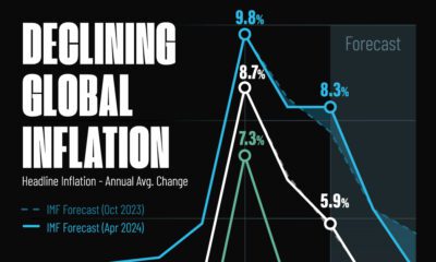
Visualizing Global Inflation Forecasts (2024-2026)
-
 United States1 week ago
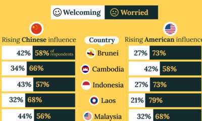
Charted: What Southeast Asia Thinks About China & the U.S.