Green
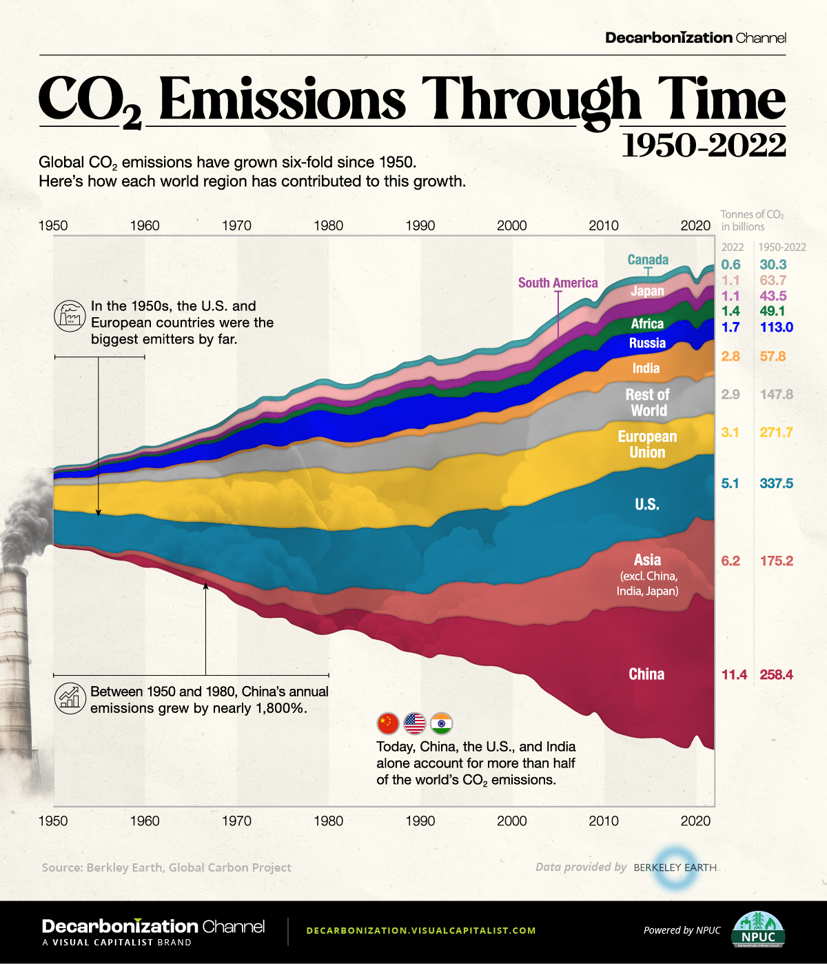
Visualized: Global CO2 Emissions Through Time (1950–2022)
Subscribe to the Decarbonization Channel’s free mailing list for more like this
Visualized: Global CO2 Emissions Through Time (1950-2022)
This was originally posted on the Decarbonization Channel. Subscribe to the free mailing list to be the first to see graphics related to decarbonization with a focus on the U.S. energy sector.
Global CO2 emissions have grown six-fold since 1950.
But which countries have contributed the most to this growth?
In this streamgraph, created in partnership with the National Public Utilities Council, we answer that question using regional emissions data from Berkeley Earth and Global Carbon Project.
Global CO2 Emissions: The Last 70 Years in Review
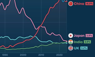
In the 1950s, the United States and the countries that later formed the European Union (EU) were the biggest emitters in the world, responsible for over 70% of total annual emissions.
However, this trend swiftly changed as other nations entered the fray.
For instance, China’s economic surge in the 1970s, particularly with the advent of Deng Xiaoping’s new economic strategy in 1978, triggered a notable uptick in the country’s CO2 output. From 1950 to 2000, China witnessed a surge of over 4,500% in emissions, reaching an annual 3.6 billion tonnes by 2000.
Similarly, India, Japan, and the broader Asian region all experienced emission growth exceeding 1,000% between 1950 and 2000.
| Metric tons of carbon dioxide (tCO2) | 1950 | 2000 | 2022 | Change 1950–2000 | Change 2000–2022 |
|---|---|---|---|---|---|
| China | 0.1B | 3.6B | 11.4B | 4,529% | 213% |
| Asia (excl. China, Japan, and India) | 0.2B | 3.2B | 6.2B | 1,973% | 95% |
| United States of America | 2.5B | 6.0B | 5.1B | 136% | -16% |
| European Union | 1.8B | 4.2B | 3.1B | 134% | -26% |
| Rest of World | 0.4B | 2.5B | 2.9B | 465% | 16% |
| India | 0.1B | 1.0B | 2.8B | 1,500% | 189% |
| Russia | 0.4B | 1.5B | 1.7B | 256% | 12% |
| Africa | 0.1B | 0.9B | 1.4B | 876% | 52% |
| Japan | 0.1B | 1.3B | 1.1B | 1,132% | -17% |
| South America | 0.1B | 0.8B | 1.1B | 621% | 34% |
| Canada | 0.2B | 0.6B | 0.6B | 268% | -3% |
Data note: 1950 was used as a beginning point for the graph due to the lack of available data for many countries prior to that year.
As illustrated in the table above, the growth in global carbon emissions has slowed since 2000.
With that said, global emissions have still risen from 25 billion tonnes in 2000 to 37 billion in 2022, which is another all-time high. Today, over 40% of emissions come from the U.S. and China, underscoring their pivotal roles in shaping the global emissions landscape.
Where Are We Headed From Here?
The United Nations’ recent Emissions Gap report highlights a concerning reality: the ongoing rate of emissions combined with existing policies steers humanity towards a world that is 3°C warmer than pre-industrial levels. This contrasts starkly with the goals of 1.5–2°C agreed to in 2015.
The Intergovernmental Panel on Climate Change projects that such a degree of warming will potentially result in catastrophic repercussions, from severe changes in weather patterns to rising sea levels, widespread extinctions, and critical disruptions to global food and water systems.


Environment
The Rise in America’s Billion-Dollar Extreme Weather Disasters
From tropical cyclones to severe storms, the number of extreme weather disasters with losses exceeding $1 billion has climbed over time.
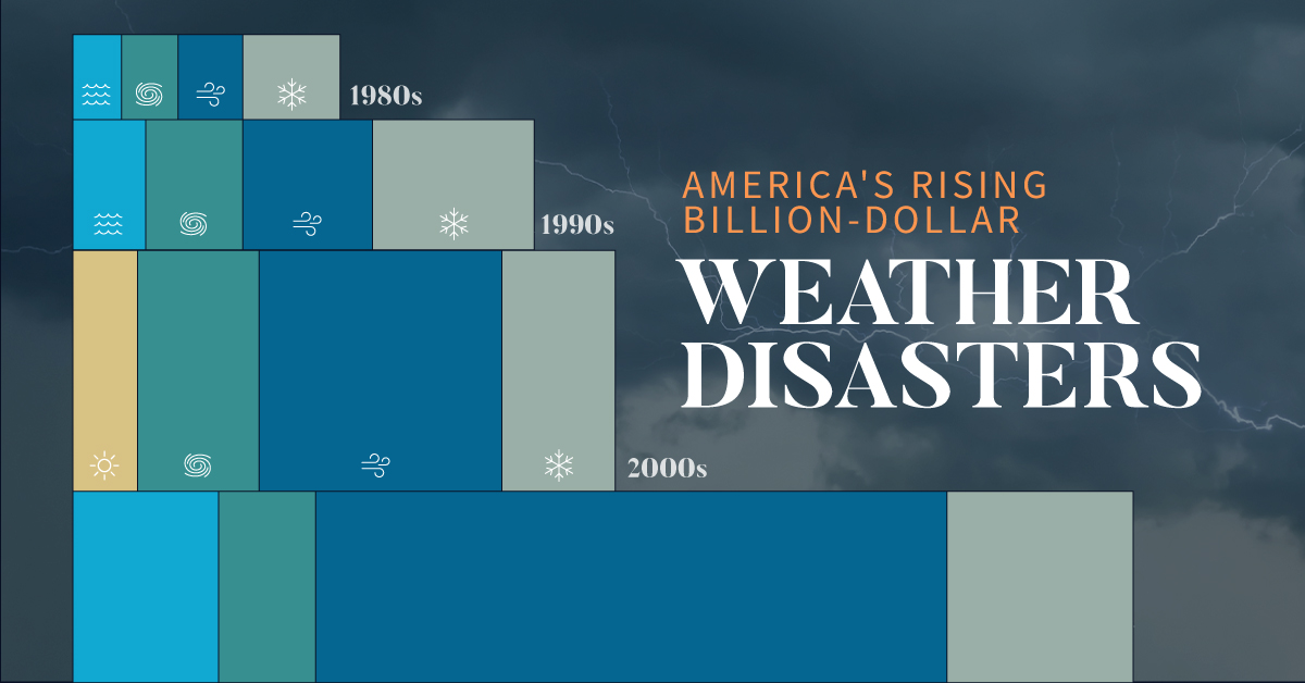
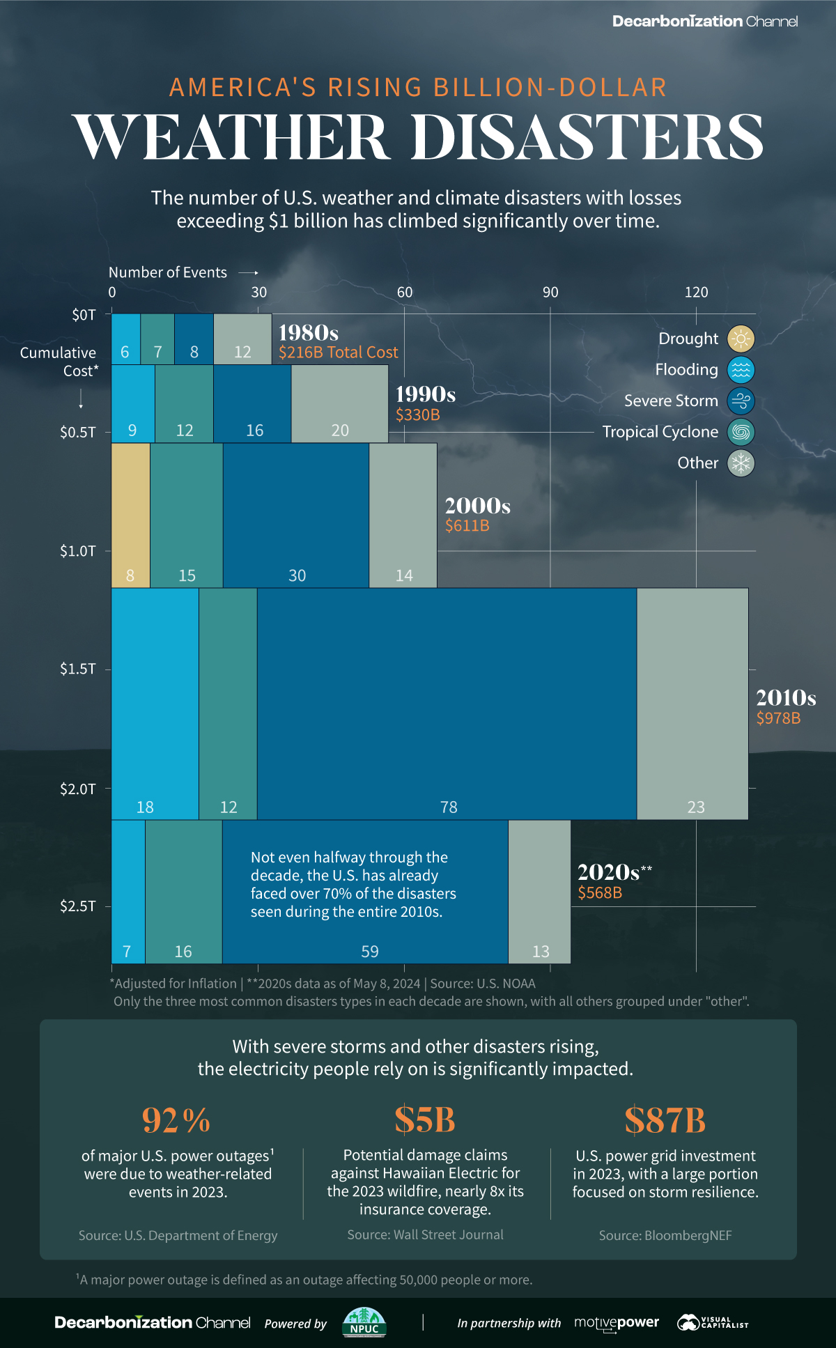
The Rise in U.S. Billion-Dollar Extreme Weather Disasters
Since 1980, there have been 383 extreme weather or climate disasters where the damages reached at least $1 billion. In total, these disasters have cost more than $2.7 trillion.
Created in partnership with the National Public Utilities Council, this chart shows how these disasters have been increasing with each passing decade.
A Growing Concern
The U.S. National Oceanic and Atmospheric Administration (NOAA) tracks each disaster and estimates the cost based on factors like physical damages and time losses such as business interruption. They adjust all costs by the Consumer Price Index to account for inflation.
| Decade | Total No. of Events | Total Inflation-Adjusted Cost |
|---|---|---|
| 1980s | 33 | $216B |
| 1990s | 57 | $330B |
| 2000s | 67 | $611B |
| 2010s | 131 | $978B |
| 2020s* | 95 | $568B |
* Data is as of May 8, 2024.
Both the number and cost of extreme weather disasters has grown over time. In fact, not even halfway through the 2020s the number of disasters is over 70% of those seen during the entire 2010s.
Severe storms have been the most common, accounting for half of all billion-dollar disasters since 1980. In terms of costs, tropical cyclones have caused the lion’s share—more than 50% of the total. Hurricane Katrina, which made landfall in 2005, remains the most expensive single event with $199 billion in inflation-adjusted costs.
Electricity and Extreme Weather Disasters
With severe storms and other disasters rising, the electricity people rely on is significantly impacted. For instance, droughts have been associated with a decline in hydropower, which is an important source of U.S. renewable electricity generation.
Disasters can also lead to significant costs for utility companies. Hawaii Electric faces $5 billion in potential damages claims for the 2023 wildfire, which is nearly eight times its insurance coverage. Lawsuits accuse the company of negligence in maintaining its infrastructure, such as failing to strengthen power poles to withstand high winds.
Given that the utilities industry is facing the highest risk from extreme weather and climate disasters, some companies have begun to prepare for such events. This means taking steps like burying power lines, increasing insurance coverage, and upgrading infrastructure.
Learn how the National Public Utilities Council is working toward the future of sustainable electricity.

-

 Environment2 months ago
Ranked: Top Countries by Total Forest Loss Since 2001
The country with the most forest loss since 2001 lost as much forest cover as the next four countries combined.
-
 Environment3 months ago
Charted: Share of World Forests by Country
We visualize which countries have the biggest share of world forests by area—and while country size plays a factor, so too, does the environment.
-
 Environment4 months ago
Which Countries Have the Largest Forests?
Together, the top five countries with the largest forests account for more than half of the world’s entire forest cover.
-

 Environment5 months ago
Visualized: What Lives in Your Gut Microbiome?
The human gut microbiome contains a world of microbes. We look at the the bacteria that deeply affect our health and well-being.
-
 Green6 months ago
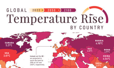
Mapped: Global Temperature Rise by Country (2022-2100P)
In this set of three maps, we show the global temperature rise on a national level for 2022, 2050, and 2100 based on an analysis by…
-
 Environment6 months ago
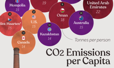
Ranked: Per Capita Carbon Emissions by Country
Which countries rank the highest in per capita carbon emissions, and how do they impact the world’s total carbon emissions?
-
 Maps1 week ago
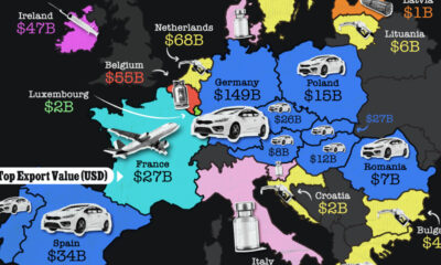
Mapped: The Top Export in Each EU Country
-

 Crime2 weeks ago
Visualizing Global Losses from Financial Scams
-
 Mining2 weeks ago
The Biggest Salt Producing Countries in 2023
-
 Markets2 weeks ago
Ranked: The Top 6 Economies by Share of Global GDP (1980-2024)
-
 Money2 weeks ago
Visualizing America’s Average Retirement Savings, by Age
-
 Markets2 weeks ago
Top 10 Countries Most in Debt to the IMF
-

 Politics2 weeks ago
Charted: How Democrats and Republicans View Government Agencies
-
 Maps2 weeks ago
Mapped: The Top Exports in Asian Countries