
How much longer do women live compared to men in Asia?
Like this map and want to support Landgeist? The best way to support Landgeist, is by sharing this map. When you share this map, make sure that you credit Landgeist and link to the source article. If you share it on Instagram, just tag @Land_geist. On Twitter tag @Landgeist.
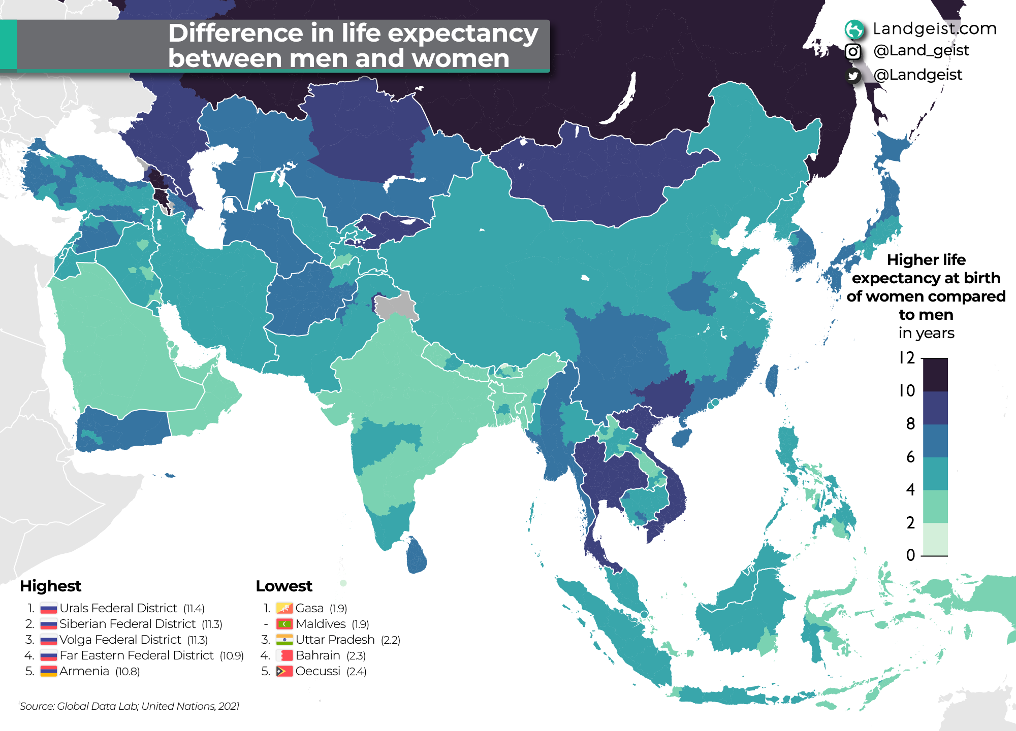
We’ve looked before at the life expectancy in Asia. On this map, we’re going to look at the difference in life expectancy at birth between men and women. The map show the number of years that women have a higher life expectancy at birth.
For most Asian regions, women have between 2 and 8 years higher life expectancy than men. The world average is 5.1 years.
The difference is smaller in countries like India, Bangladesh, Bhutan, Nepal, Saudi Arabia, Bahrain, Qatar, the UAE and Oman. The difference is higher in countries like Thailand, Vietnam, Kyrgyzstan and Mongolia. However, in Armenia, Georgia and Russia, it’s much much higher than any other area in Asia. Especially in Russia where in all the Asian regions of Russia, women live more than 10 years longer than men.
The data for this map comes from the Global Data Lab.

3 comments