Green
Visualized: Food Waste in the United States
![]() See this visualization first on the Voronoi app.
See this visualization first on the Voronoi app.

Visualized: Food Waste in the United States
This was originally posted on the Voronoi app. Download the app for free on iOS or Android and discover incredible data-driven charts from a variety of trusted sources.
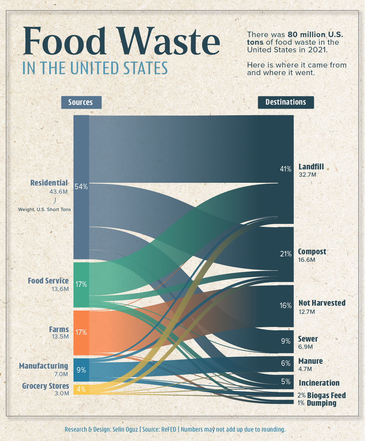
Did you know that there is more than 80 million tons of food wasted in the U.S. every year?
To explore where this waste came from and where it went, this graphic by Selin Oğuz visualizes the flow of food waste in the U.S. in 2021 using data from ReFED.
Following Waste from Source to Destination
The biggest source of food waste in the U.S. stemmed from residential households in 2021, accounting for more than 50% of the total.
Farms and the food service industry followed, each accounting for more than 13 million U.S. tons (short tons) of food waste in the same year.
| Sources | Weight, U.S. Short Tons | Share of Total |
|---|---|---|
| Residential | 43.6M | 54.0% |
| Food Service | 13.6M | 16.9% |
| Farm | 13.5M | 16.7% |
| Manufacturing | 7.02M | 8.7% |
| Retail | 3.01M | 3.8% |
| Total | 80.73M | 100% |
But where did all of this food waste end up?
The data shows us that the answer is primarily landfills, followed by compost and being left unharvested, which occurs due to reasons such as market variability, insufficient labor, or food safety concerns.
What Food Waste Means for the Environment
Whether it’s as a result of spoilage, poor planning, or unrealistic cosmetic standards for produce, food waste squanders valuable resources—such as water, energy, and labor—and intensifies global hunger and food insecurity, according to the United Nations.
Food waste is also a huge source of greenhouse gas (GHG) emissions, contributing to climate change. According to the U.S. Environmental Protection Agency, an estimated 190 million U.S. tons of GHG emissions result from food waste annually.
To put that number into perspective, that is equivalent to the annual emissions of 42 coal power plants.
Overall, the data highlights that food waste occurs at every stage of the food supply chain. Reducing this waste, especially where it is prominently high, can be crucial in achieving food system sustainability in the U.S. and beyond.

This article was published as a part of Visual Capitalist's Creator Program, which features data-driven visuals from some of our favorite Creators around the world.


Automotive
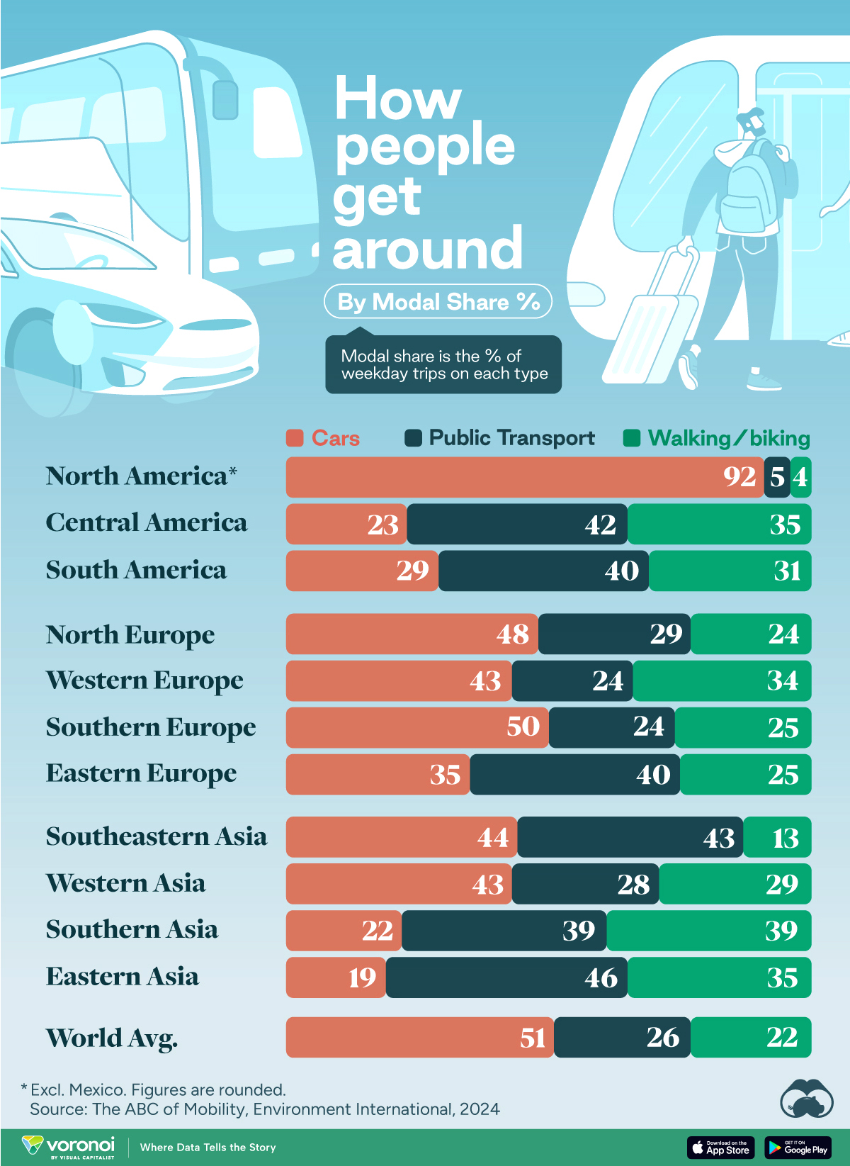
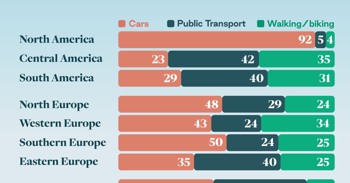
How People Get Around in America, Europe, and Asia
Examining how people get around using cars, public transit, and walking or biking, and the regional differences in usage.
How People Get Around in America, Europe, and Asia
This was originally posted on our Voronoi app. Download the app for free on iOS or Android and discover incredible data-driven charts from a variety of trusted sources.
This chart highlights the popularity of different transportation types in the Americas, Europe, and Asia, calculated by modal share.
Data for this article and visualization is sourced from ‘The ABC of Mobility’, a research paper by Rafael Prieto-Curiel (Complexity Science Hub) and Juan P. Ospina (EAFIT University), accessed through ScienceDirect.
The authors gathered their modal share data through travel surveys, which focused on the primary mode of transportation a person employs for each weekday trip. Information from 800 cities across 61 countries was collected for this study.
North American Car Culture Contrasts with the Rest of the World
In the U.S. and Canada, people heavily rely on cars to get around, no matter the size of the city. There are a few exceptions of course, such as New York, Toronto, and smaller college towns across the United States.
| Region | 🚗 Cars | 🚌 Public Transport | 🚶 Walking/Biking |
|---|---|---|---|
| North America* | 92% | 5% | 4% |
| Central America | 23% | 42% | 35% |
| South America | 29% | 40% | 31% |
| Northern Europe | 48% | 29% | 24% |
| Western Europe | 43% | 24% | 34% |
| Southern Europe | 50% | 24% | 25% |
| Eastern Europe | 35% | 40% | 25% |
| Southeastern Asia | 44% | 43% | 13% |
| Western Asia | 43% | 28% | 29% |
| Southern Asia | 22% | 39% | 39% |
| Eastern Asia | 19% | 46% | 35% |
| World | 51% | 26% | 22% |
Note: *Excluding Mexico. Percentages are rounded.
As a result, North America’s share of public transport and active mobility (walking and biking) is the lowest amongst all surveyed regions by a significant amount.
On the other hand, public transport reigns supreme in South and Central America as well as Southern and Eastern Asia. It ties with cars in Southeastern Asia, and is eclipsed by cars in Western Asia.
As outlined in the paper, Europe sees more city-level differences in transport popularity.
For example, Utrecht, Netherlands prefers walking and biking. People in Paris and London like using their extensive transit systems. And in Manchester and Rome, roughly two out of three journeys are by car.

-

 Personal Finance1 week ago
Visualizing the Tax Burden of Every U.S. State
-

 Misc6 days ago
Visualized: Aircraft Carriers by Country
-
 Culture7 days ago
How Popular Snack Brand Logos Have Changed
-
 Mining1 week ago
Visualizing Copper Production by Country in 2023
-

 Misc1 week ago
Charted: How Americans Feel About Federal Government Agencies
-
 Healthcare1 week ago
Which Countries Have the Highest Infant Mortality Rates?
-
 Demographics1 week ago
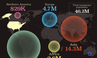
Mapped: U.S. Immigrants by Region
-
 Maps1 week ago
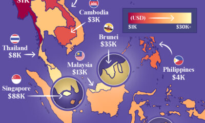
Mapped: Southeast Asia’s GDP Per Capita, by Country