NASA Data Viz Wizards Model the Movement of Ocean Garbage Patches
Released on 08/18/2015
[Greg] Hey, it's Greg Shira from NASA's
Scientific Visualization Studio.
We wanted to see if we could visualize
the so-called ocean garbage patches.
We start with data from floating scientific buoys
that NOAA has been distributing in the oceans
for the last 35 years,
represented here as white dots.
Let's speed up time to see where the buoys go.
Since new buoys are continually released,
it's hard to tell where older buoys move to.
Let's clear the map and add
the starting locations of all the buoys.
Interesting patterns appear all of the place.
Lines of buoys are due to ships and planes
that released buoys periodically.
If we let all the buoys go at the same time
we can observe buoy migration patterns.
The number of buoys decreases because some buoys
don't last as long as others.
The buoys migrate to five known gyres,
also known as ocean garbage patches.
We can also see this in a computational model
of ocean currents, called Echo 2.
We release particles evenly around the world
and the model currents carry the particles.
The particles from the model also migrate
to the garbage patches.
Even though the read-time buoys
and model particles did not react
to currents at the same times,
the fact that the data tend to accumulate
in the same regions shows how robust the result is.

Data Driven: How Max Homa and the PGA Tour Embrace Data to Up Their Game | WIRED Brand Lab
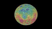
Stunning Views of Dwarf Planet Ceres

This Wasp Mind-Controls Spiders While Eating Them Alive

Absurd Creatures | The Horrifying Sting of the Tarantula Hawk Wasp
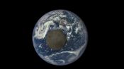
Earth's Selfie Satellite

Big Question | Can Cats Make Us Crazy?

Astronauts Eat First Space Grown Salad

Absurd Creatures | Pucker Up With the Truck-Sized Ocean Sunfish

Using Live Oak Trees as a Blueprint for Surviving Hurricanes
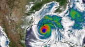
Predicting Hurricanes in High Definition


