Misc
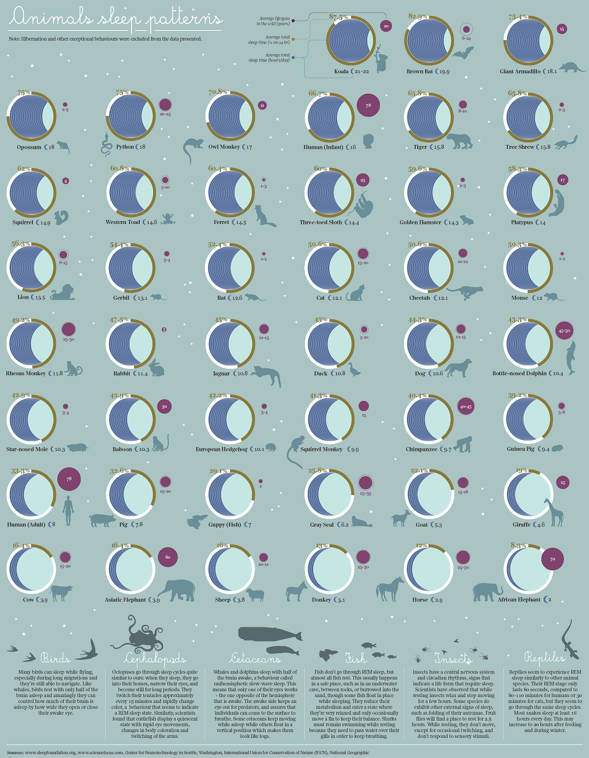
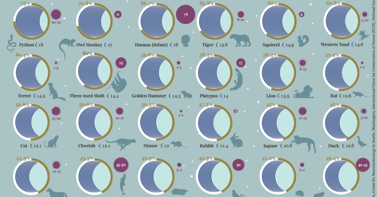
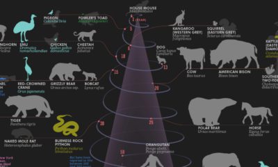
Visualizing 40 Different Animal Sleep Patterns
Article/Editing:
Click to view a larger version of the graphic.
Visualizing 40 Different Animal Sleep Patterns
Every animal has to rest in some way, but some animals need a lot more sleep than others.
This graphic by Giulia De Amicis uses data from startsleeping.com to show the typical sleeping patterns of 40 different animals, highlighting their average sleep times, and what percentage of each 24-hour day they spend resting.
Compared to the rest of the animals featured in the graphic, humans need a relatively small amount of sleep. We sleep for an average of eight hours—or 33% of our day.
| Animal | Average Sleep Time (hrs/day) | Average Sleep Time (% of 24 hours) |
|---|---|---|
| Koala | 21-22 | 87.5% |
| Brown Bat | 19.9 | 82.9% |
| Giant Armadillo | 18.1 | 75.4% |
| Opossum | 18.0 | 75.0% |
| Python | 18.0 | 75.0% |
| Owl Monkey | 17.0 | 70.8% |
| Human (Infant) | 16.0 | 66.7% |
| Tiger | 15.8 | 65.8% |
| Tree Shrew | 15.8 | 65.8% |
| Squirrel | 14.9 | 62.0% |
| Western Toad | 14.6 | 60.8% |
| Ferret | 14.5 | 60.4% |
| Three-toed Sloth | 14.4 | 60.0% |
| Golden Hamster | 14.3 | 59.6% |
| Platypus | 14.0 | 58.3% |
| Lion | 13.5 | 56.3% |
| Gerbil | 13.1 | 54.4% |
| Rat | 12.6 | 52.4% |
| Cat | 12.1 | 50.6% |
| Cheetah | 12.1 | 50.6% |
| Mouse | 12.0 | 50.3% |
| Rhesus Monkey | 11.8 | 49.2% |
| Rabbit | 11.4 | 47.5% |
| Jaguar | 10.8 | 45.0% |
| Duck | 10.8 | 45.0% |
| Dog | 10.6 | 44.3% |
| Bottle-nose Dolphin | 10.4 | 43.3% |
| Star-nosed Mole | 10.3 | 42.9% |
| Baboon | 10.3 | 42.9% |
| European Hedgehog | 10.1 | 42.2% |
| Squirrel Monkey | 9.9 | 41.3% |
| Chimpanzee | 9.7 | 40.4% |
| Guinea Pig | 9.4 | 39.2% |
| Human (Adult) | 8.0 | 33.3% |
| Pig | 7.8 | 32.6% |
| Guppy (Fish) | 7.0 | 29.1% |
| Gray Seal | 6.2 | 25.8% |
| Goat | 5.3 | 22.1% |
| Giraffe | 4.6 | 19.0% |
| Cow | 3.9 | 16.4% |
| Asiatic Elephant | 3.9 | 16.4% |
| Sheep | 3.8 | 16.0% |
| Donkey | 3.1 | 13.0% |
| Horse | 2.9 | 12.0% |
| African Elephant | 2.0 | 8.3% |
In contrast, Koalas sleep up to 22 hours a day, or 87.5% of the day. This is mostly because of the Koala’s diet—Koalas eat Eucalyptus leaves, which are toxic and take a lot of energy to digest.

This article was published as a part of Visual Capitalist's Creator Program, which features data-driven visuals from some of our favorite Creators around the world.


Automotive
How People Get Around in America, Europe, and Asia
Examining how people get around using cars, public transit, and walking or biking, and the regional differences in usage.
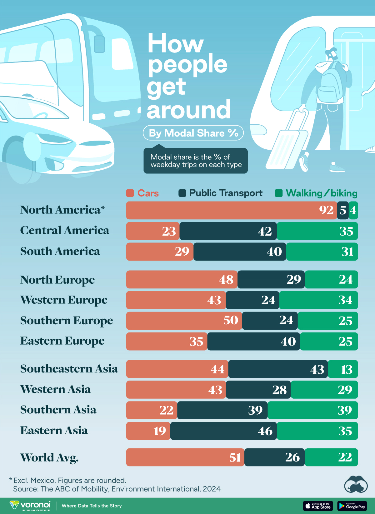
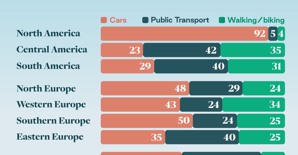
How People Get Around in America, Europe, and Asia
This was originally posted on our Voronoi app. Download the app for free on iOS or Android and discover incredible data-driven charts from a variety of trusted sources.
This chart highlights the popularity of different transportation types in the Americas, Europe, and Asia, calculated by modal share.
Data for this article and visualization is sourced from ‘The ABC of Mobility’, a research paper by Rafael Prieto-Curiel (Complexity Science Hub) and Juan P. Ospina (EAFIT University), accessed through ScienceDirect.
The authors gathered their modal share data through travel surveys, which focused on the primary mode of transportation a person employs for each weekday trip. Information from 800 cities across 61 countries was collected for this study.
North American Car Culture Contrasts with the Rest of the World
In the U.S. and Canada, people heavily rely on cars to get around, no matter the size of the city. There are a few exceptions of course, such as New York, Toronto, and smaller college towns across the United States.
| Region | 🚗 Cars | 🚌 Public Transport | 🚶 Walking/Biking |
|---|---|---|---|
| North America* | 92% | 5% | 4% |
| Central America | 23% | 42% | 35% |
| South America | 29% | 40% | 31% |
| Northern Europe | 48% | 29% | 24% |
| Western Europe | 43% | 24% | 34% |
| Southern Europe | 50% | 24% | 25% |
| Eastern Europe | 35% | 40% | 25% |
| Southeastern Asia | 44% | 43% | 13% |
| Western Asia | 43% | 28% | 29% |
| Southern Asia | 22% | 39% | 39% |
| Eastern Asia | 19% | 46% | 35% |
| World | 51% | 26% | 22% |
Note: *Excluding Mexico. Percentages are rounded.
As a result, North America’s share of public transport and active mobility (walking and biking) is the lowest amongst all surveyed regions by a significant amount.
On the other hand, public transport reigns supreme in South and Central America as well as Southern and Eastern Asia. It ties with cars in Southeastern Asia, and is eclipsed by cars in Western Asia.
As outlined in the paper, Europe sees more city-level differences in transport popularity.
For example, Utrecht, Netherlands prefers walking and biking. People in Paris and London like using their extensive transit systems. And in Manchester and Rome, roughly two out of three journeys are by car.

-
 Markets5 days ago
Visualizing Global Inflation Forecasts (2024-2026)
-

 Green2 weeks ago
The Carbon Footprint of Major Travel Methods
-

 United States2 weeks ago
Visualizing the Most Common Pets in the U.S.
-

 Culture2 weeks ago
The World’s Top Media Franchises by All-Time Revenue
-

 voronoi1 week ago
Best Visualizations of April on the Voronoi App
-

 Wealth1 week ago
Charted: Which Country Has the Most Billionaires in 2024?
-

 Business1 week ago
The Top Private Equity Firms by Country
-

 Jobs1 week ago
The Best U.S. Companies to Work for According to LinkedIn