Green
Ranked: The Foods With the Largest Environmental Impact
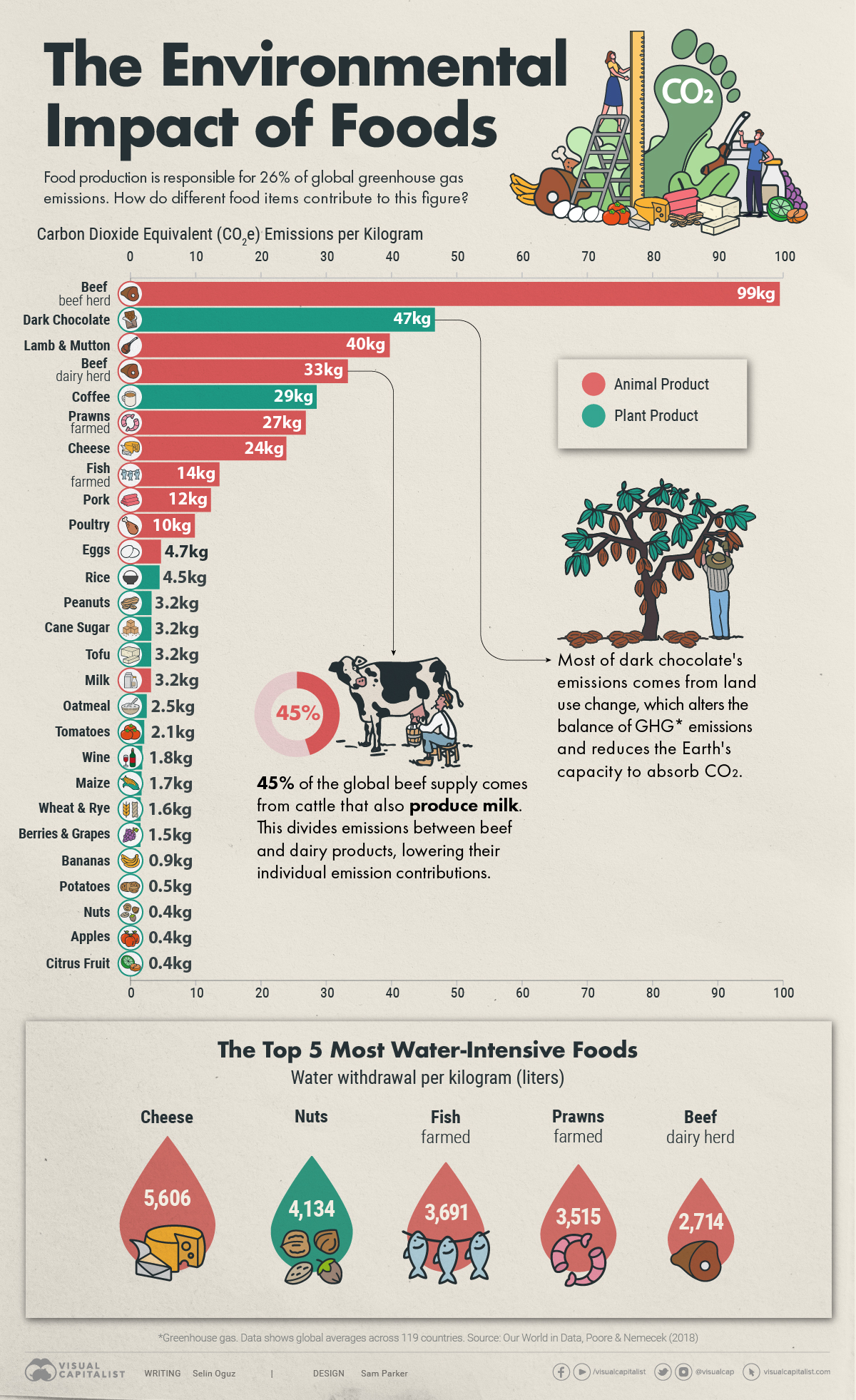


The Environmental Impacts of Food Production
Food and agriculture have a significant impact on our planet, particularly in terms of carbon emissions, water withdrawals, and land use.
To visualize how different food items contribute to this environmental impact, the above graphic ranks foods based on their greenhouse gas (GHG) emissions and water withdrawals, using data from Poore and Nemecek and Our World in Data.
The Carbon Giants
Based on carbon dioxide equivalent (CO2e) measurements, beef comes in first place as the food with the largest carbon footprint, emitting an astounding 99 kilograms of CO2e per kilogram of the final meat product.
CO2e emissions are a standardized measure that express the warming impact of various greenhouse gases—such as methane and nitrous oxide—in terms of the amount of CO2 that would have the same warming effect.
The production of beef is extremely resource-intensive, demanding substantial land, water, and energy resources. Cows also produce methane during their digestive processes, a gas that has a warming potential 27–30 times higher than that of CO2 over a 100-year time period.
| Food item | CO2e emissions per kilogram |
|---|---|
| Beef (beef herd) | 99.48 kg |
| Dark Chocolate | 46.65 kg |
| Lamb & Mutton | 39.72 kg |
| Beef (dairy herd) | 33.30 kg |
| Coffee | 28.53 kg |
| Prawns (farmed) | 26.87 kg |
| Cheese | 23.88 kg |
| Fish (farmed) | 13.63 kg |
| Pork | 12.31 kg |
| Poultry | 9.87 kg |
| Eggs | 4.67 kg |
| Rice | 4.45 kg |
| Peanuts | 3.23 kg |
| Cane Sugar | 3.20 kg |
| Tofu | 3.16 kg |
| Milk | 3.15 kg |
| Oatmeal | 2.48 kg |
| Tomatoes | 2.09 kg |
| Wine | 1.79 kg |
| Maize | 1.70 kg |
| Wheat & Rye | 1.57 kg |
| Berries & Grapes | 1.53 kg |
| Bananas | 0.86 kg |
| Potatoes | 0.46 kg |
| Apples | 0.43 kg |
| Nuts | 0.43 kg |
| Root Vegetables | 0.43 kg |
| Citrus Fruit | 0.39 kg |
Following beef on the list is dark chocolate, albeit not very closely.
Most of dark chocolate’s emissions come from land use changes—such as deforestation— which alters the balance of GHG emissions and reduces the Earth’s capacity to absorb CO2.
All in all, however, the data shows us that animal products are generally more emission-intensive than plant-based foods.
Water Use in Food Production
The Food and Agriculture Organization (FAO) states that more than two-thirds of the world’s freshwater withdrawals are used for food production.
Interestingly, the trend that we saw when considering the carbon footprints of foods also applies when it comes to water use. Among the top 10 most water-intensive foods in the world, 70% are of animal origin, highlighting that animal products aren’t only more carbon-intensive but also more water-intensive than plant products.
| Food item | Water withdrawal per kilogram |
|---|---|
| Cheese | 5,605 liters |
| Nuts | 4,134 liters |
| Fish (farmed) | 3,691 liters |
| Prawns (farmed) | 3,515 liters |
| Beef (dairy herd) | 2,714 liters |
| Rice | 2,248 liters |
| Peanuts | 1,852 liters |
| Lamb & Mutton | 1,803 liters |
| Pork | 1,796 liters |
| Beef (beef herd) | 1,451 liters |
Peanuts, rice, and nuts (which include hard-shelled fruits such as hazelnuts, chestnuts, and walnuts) make up the plant-based outliers in the list.
Making More Sustainable Food Choices
Eating locally sourced foods is often posed as a solution for lowering our ecological impact, leading to the growing popularity of concepts such as “The 100 Mile Diet.”
An analysis done by Our World in Data, however, shows us that what we eat makes more of a difference in lowering our environmental footprints than where our food comes from.
More specifically, the data highlights that transportation accounts for just 5% of global food emissions. Land use change and farming activities, on the other hand, account for a much more significant portion.
As such, redirecting our attention from the distance food travels to the emissions associated with its production can yield better outcomes in our efforts to make more sustainable food choices.


Automotive
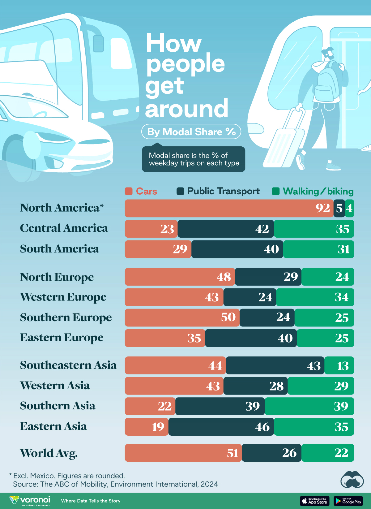
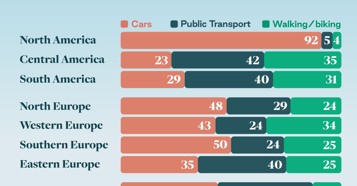
How People Get Around in America, Europe, and Asia
Examining how people get around using cars, public transit, and walking or biking, and the regional differences in usage.
How People Get Around in America, Europe, and Asia
This was originally posted on our Voronoi app. Download the app for free on iOS or Android and discover incredible data-driven charts from a variety of trusted sources.
This chart highlights the popularity of different transportation types in the Americas, Europe, and Asia, calculated by modal share.
Data for this article and visualization is sourced from ‘The ABC of Mobility’, a research paper by Rafael Prieto-Curiel (Complexity Science Hub) and Juan P. Ospina (EAFIT University), accessed through ScienceDirect.
The authors gathered their modal share data through travel surveys, which focused on the primary mode of transportation a person employs for each weekday trip. Information from 800 cities across 61 countries was collected for this study.
North American Car Culture Contrasts with the Rest of the World
In the U.S. and Canada, people heavily rely on cars to get around, no matter the size of the city. There are a few exceptions of course, such as New York, Toronto, and smaller college towns across the United States.
| Region | 🚗 Cars | 🚌 Public Transport | 🚶 Walking/Biking |
|---|---|---|---|
| North America* | 92% | 5% | 4% |
| Central America | 23% | 42% | 35% |
| South America | 29% | 40% | 31% |
| Northern Europe | 48% | 29% | 24% |
| Western Europe | 43% | 24% | 34% |
| Southern Europe | 50% | 24% | 25% |
| Eastern Europe | 35% | 40% | 25% |
| Southeastern Asia | 44% | 43% | 13% |
| Western Asia | 43% | 28% | 29% |
| Southern Asia | 22% | 39% | 39% |
| Eastern Asia | 19% | 46% | 35% |
| World | 51% | 26% | 22% |
Note: *Excluding Mexico. Percentages are rounded.
As a result, North America’s share of public transport and active mobility (walking and biking) is the lowest amongst all surveyed regions by a significant amount.
On the other hand, public transport reigns supreme in South and Central America as well as Southern and Eastern Asia. It ties with cars in Southeastern Asia, and is eclipsed by cars in Western Asia.
As outlined in the paper, Europe sees more city-level differences in transport popularity.
For example, Utrecht, Netherlands prefers walking and biking. People in Paris and London like using their extensive transit systems. And in Manchester and Rome, roughly two out of three journeys are by car.

-
 Markets5 days ago
Visualizing Global Inflation Forecasts (2024-2026)
-

 Green2 weeks ago
The Carbon Footprint of Major Travel Methods
-

 United States2 weeks ago
Visualizing the Most Common Pets in the U.S.
-

 Culture2 weeks ago
The World’s Top Media Franchises by All-Time Revenue
-

 voronoi1 week ago
Best Visualizations of April on the Voronoi App
-

 Wealth1 week ago
Charted: Which Country Has the Most Billionaires in 2024?
-

 Business1 week ago
The Top Private Equity Firms by Country
-

 Markets1 week ago
The Best U.S. Companies to Work for According to LinkedIn