Green
Visualized: Global CO2 Emissions Through Time (1950–2022)
Subscribe to the Decarbonization Channel’s free mailing list for more like this
Visualized: Global CO2 Emissions Through Time (1950-2022)
This was originally posted on the Decarbonization Channel. Subscribe to the free mailing list to be the first to see graphics related to decarbonization with a focus on the U.S. energy sector.
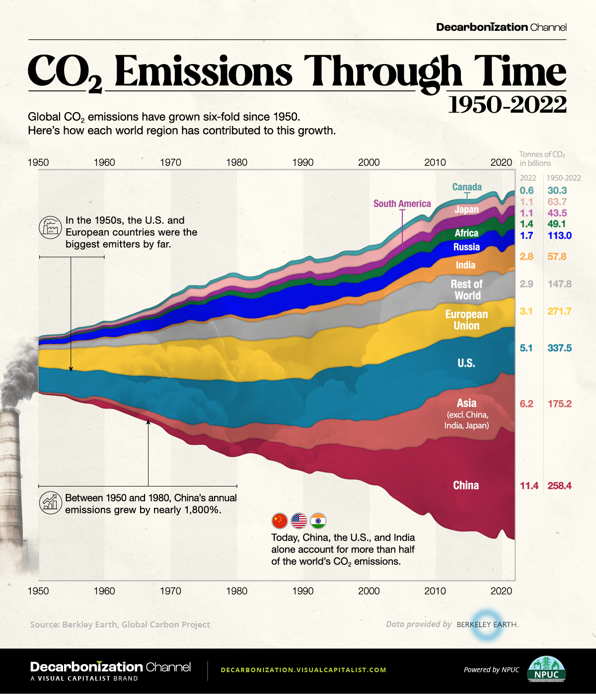
Global CO2 emissions have grown six-fold since 1950.
But which countries have contributed the most to this growth?
In this streamgraph, created in partnership with the National Public Utilities Council, we answer that question using regional emissions data from Berkeley Earth and Global Carbon Project.
Global CO2 Emissions: The Last 70 Years in Review
In the 1950s, the United States and the countries that later formed the European Union (EU) were the biggest emitters in the world, responsible for over 70% of total annual emissions.
However, this trend swiftly changed as other nations entered the fray.
For instance, China’s economic surge in the 1970s, particularly with the advent of Deng Xiaoping’s new economic strategy in 1978, triggered a notable uptick in the country’s CO2 output. From 1950 to 2000, China witnessed a surge of over 4,500% in emissions, reaching an annual 3.6 billion tonnes by 2000.
Similarly, India, Japan, and the broader Asian region all experienced emission growth exceeding 1,000% between 1950 and 2000.
| Metric tons of carbon dioxide (tCO2) | 1950 | 2000 | 2022 | Change 1950–2000 | Change 2000–2022 |
|---|---|---|---|---|---|
| China | 0.1B | 3.6B | 11.4B | 4,529% | 213% |
| Asia (excl. China, Japan, and India) | 0.2B | 3.2B | 6.2B | 1,973% | 95% |
| United States of America | 2.5B | 6.0B | 5.1B | 136% | -16% |
| European Union | 1.8B | 4.2B | 3.1B | 134% | -26% |
| Rest of World | 0.4B | 2.5B | 2.9B | 465% | 16% |
| India | 0.1B | 1.0B | 2.8B | 1,500% | 189% |
| Russia | 0.4B | 1.5B | 1.7B | 256% | 12% |
| Africa | 0.1B | 0.9B | 1.4B | 876% | 52% |
| Japan | 0.1B | 1.3B | 1.1B | 1,132% | -17% |
| South America | 0.1B | 0.8B | 1.1B | 621% | 34% |
| Canada | 0.2B | 0.6B | 0.6B | 268% | -3% |
Data note: 1950 was used as a beginning point for the graph due to the lack of available data for many countries prior to that year.
As illustrated in the table above, the growth in global carbon emissions has slowed since 2000.
With that said, global emissions have still risen from 25 billion tonnes in 2000 to 37 billion in 2022, which is another all-time high. Today, over 40% of emissions come from the U.S. and China, underscoring their pivotal roles in shaping the global emissions landscape.
Where Are We Headed From Here?
The United Nations’ recent Emissions Gap report highlights a concerning reality: the ongoing rate of emissions combined with existing policies steers humanity towards a world that is 3°C warmer than pre-industrial levels. This contrasts starkly with the goals of 1.5–2°C agreed to in 2015.
The Intergovernmental Panel on Climate Change projects that such a degree of warming will potentially result in catastrophic repercussions, from severe changes in weather patterns to rising sea levels, widespread extinctions, and critical disruptions to global food and water systems.


Automotive
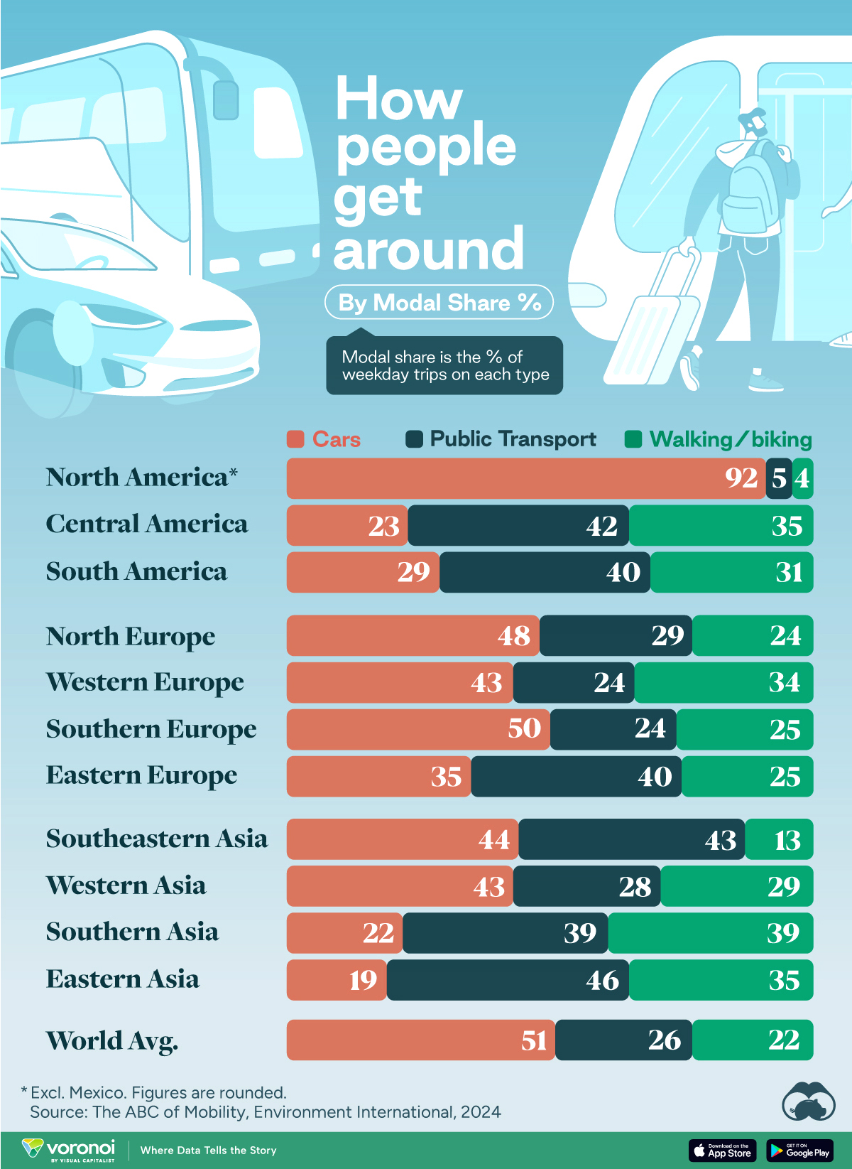
How People Get Around in America, Europe, and Asia
Examining how people get around using cars, public transit, and walking or biking, and the regional differences in usage.
How People Get Around in America, Europe, and Asia
This was originally posted on our Voronoi app. Download the app for free on iOS or Android and discover incredible data-driven charts from a variety of trusted sources.
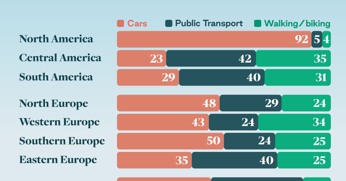
This chart highlights the popularity of different transportation types in the Americas, Europe, and Asia, calculated by modal share.
Data for this article and visualization is sourced from ‘The ABC of Mobility’, a research paper by Rafael Prieto-Curiel (Complexity Science Hub) and Juan P. Ospina (EAFIT University), accessed through ScienceDirect.
The authors gathered their modal share data through travel surveys, which focused on the primary mode of transportation a person employs for each weekday trip. Information from 800 cities across 61 countries was collected for this study.
North American Car Culture Contrasts with the Rest of the World
In the U.S. and Canada, people heavily rely on cars to get around, no matter the size of the city. There are a few exceptions of course, such as New York, Toronto, and smaller college towns across the United States.
| Region | 🚗 Cars | 🚌 Public Transport | 🚶 Walking/Biking |
|---|---|---|---|
| North America* | 92% | 5% | 4% |
| Central America | 23% | 42% | 35% |
| South America | 29% | 40% | 31% |
| Northern Europe | 48% | 29% | 24% |
| Western Europe | 43% | 24% | 34% |
| Southern Europe | 50% | 24% | 25% |
| Eastern Europe | 35% | 40% | 25% |
| Southeastern Asia | 44% | 43% | 13% |
| Western Asia | 43% | 28% | 29% |
| Southern Asia | 22% | 39% | 39% |
| Eastern Asia | 19% | 46% | 35% |
| World | 51% | 26% | 22% |
Note: *Excluding Mexico. Percentages are rounded.
As a result, North America’s share of public transport and active mobility (walking and biking) is the lowest amongst all surveyed regions by a significant amount.
On the other hand, public transport reigns supreme in South and Central America as well as Southern and Eastern Asia. It ties with cars in Southeastern Asia, and is eclipsed by cars in Western Asia.
As outlined in the paper, Europe sees more city-level differences in transport popularity.
For example, Utrecht, Netherlands prefers walking and biking. People in Paris and London like using their extensive transit systems. And in Manchester and Rome, roughly two out of three journeys are by car.

-
 Markets5 days ago
Visualizing Global Inflation Forecasts (2024-2026)
-

 Green2 weeks ago
The Carbon Footprint of Major Travel Methods
-

 United States2 weeks ago
Visualizing the Most Common Pets in the U.S.
-

 Culture2 weeks ago
The World’s Top Media Franchises by All-Time Revenue
-

 voronoi1 week ago
Best Visualizations of April on the Voronoi App
-

 Wealth1 week ago
Charted: Which Country Has the Most Billionaires in 2024?
-

 Business1 week ago
The Top Private Equity Firms by Country
-

 Markets1 week ago
The Best U.S. Companies to Work for According to LinkedIn