
How much longer do women live compared to men in Africa?
Like this map and want to support Landgeist? The best way to support Landgeist, is by sharing this map. When you share this map, make sure that you credit Landgeist and link to the source article. If you share it on Instagram, just tag @Land_geist. On Twitter tag @Landgeist.
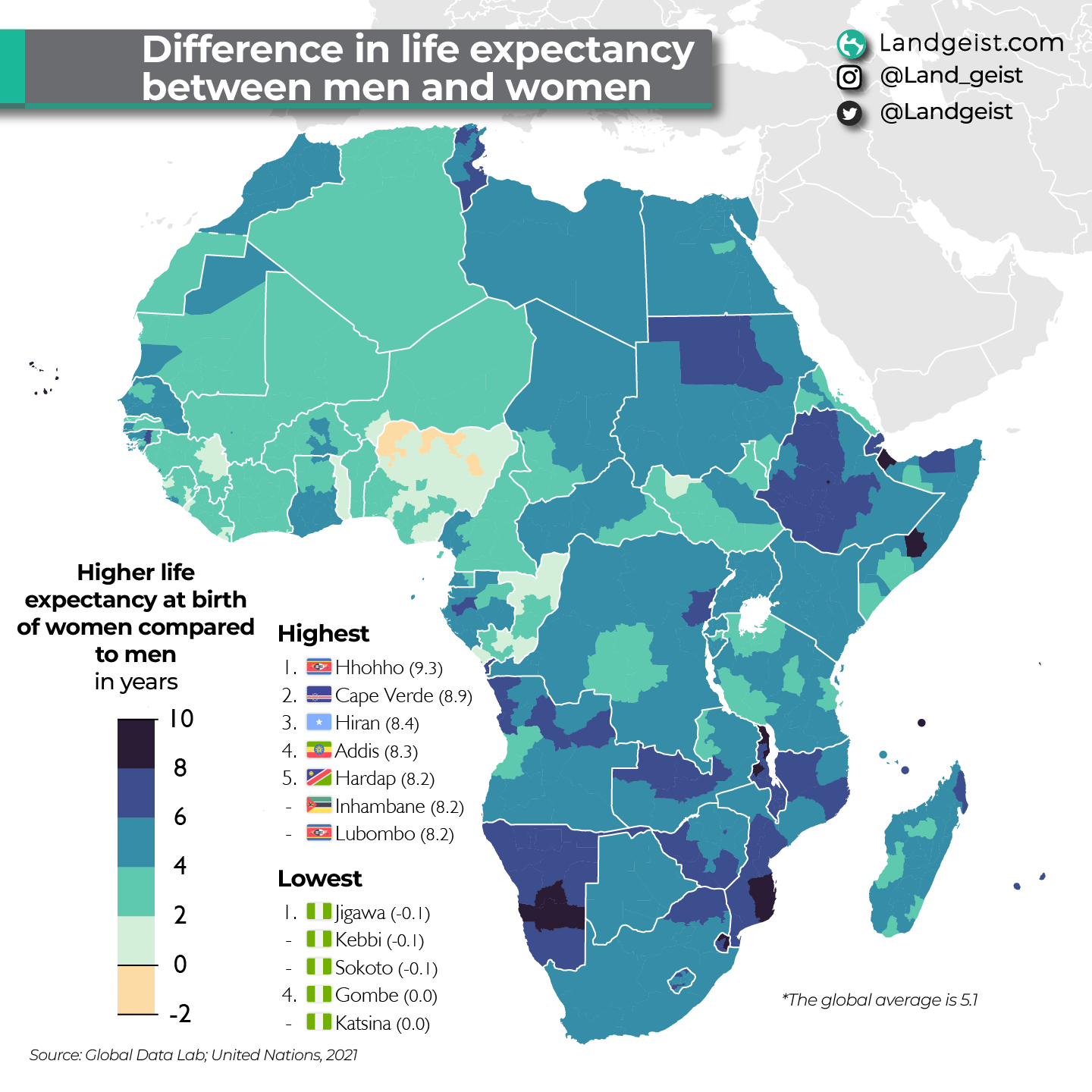
It’s normal that women on average live longer than men. Globally, women have a life expectancy that’s 5.1 years higher than men. On this map, we’re going to look at the difference in life expectancy at birth between men and women in Africa. The map show the number of years that women have a higher life expectancy at birth.Compared to Europe or Asia, the differences within countries, are much smaller in North America. It’s only in Canada, the US, Haiti, Jamaica, Honduras and Nicaragua, that there are some more significant differences between regions, but it’s still quite small.
The difference in life expectancy at birth between men and women is the biggest is eSwatini, Cabo Verde, Malawi and Namibia. The difference is smaller in places like Nigeria, Republic of the Congo and Togo. In some regions in northern Nigeria, men even have the same or a slightly higher life expectancy than women. This is the only area in the world where that’s the case.
The data for this map comes from the Global Data.
