Markets
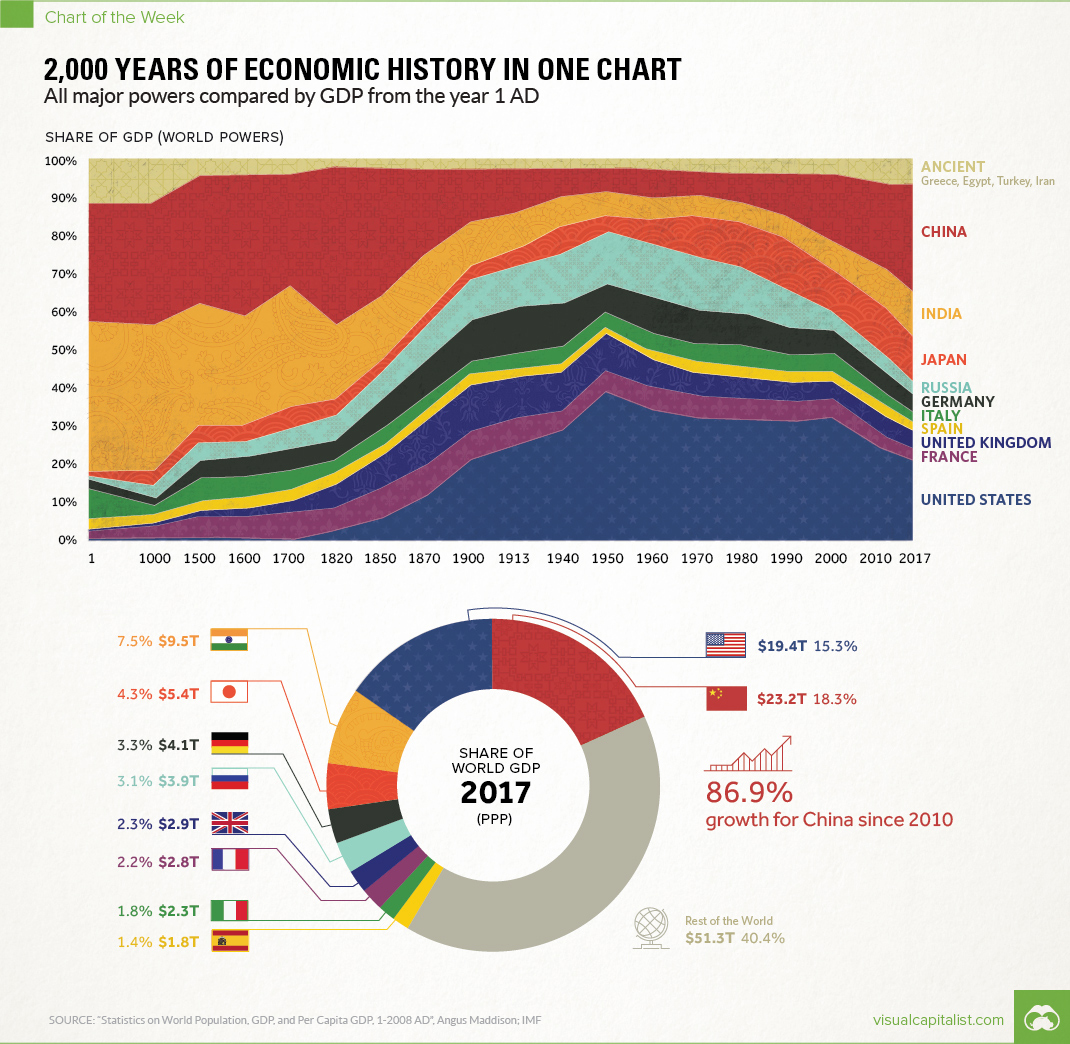
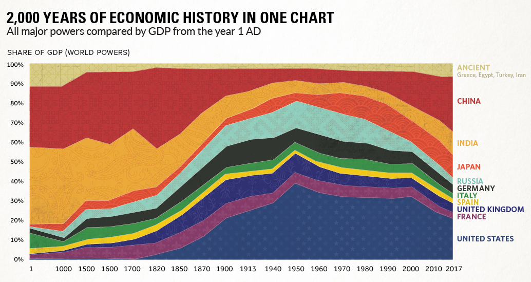
2,000 Years of Economic History in One Chart
Over 2,000 Years of Economic History in One Chart
All major powers compared by GDP from the year 1 AD
The Chart of the Week is a weekly Visual Capitalist feature on Fridays.
Long before the invention of modern day maps or gunpowder, the planet’s major powers were already duking it out for economic and geopolitical supremacy.
Today’s chart tells that story in the simplest terms possible. By showing the changing share of the global economy for each country from 1 AD until now, it compares economic productivity over a mind-boggling time period.
Originally published in a research letter by Michael Cembalest of JP Morgan, we’ve updated it based on the most recent data and projections from the IMF. If you like, you can still find the original chart (which goes to 2008) at The Atlantic. It’s also worth noting that the original source for all the data up until 2008 is from the late Angus Maddison, a famous economic historian that published estimates on population, GDP, and other figures going back to Roman times.
A Major Caveat
If you looked at the chart in any depth, you probably noticed a big problem with it. The time periods between data points aren’t equal – in fact, they are not close at all.
The first gap on the x-axis is 1,000 years and the second is 500 years. Then, as we get closer to modernity, the chart uses mostly 10 year intervals. Changing the scale like this is a big data visualization “no no”, as rightly pointed out in a blog post by The Economist.
While we completely agree, we have a made an exception in this case. Why? Because getting good economic data from the early 20th century is already difficult enough – and so trying to find data in regular intervals before then seems like a fool’s errand. Likewise, a stacked bar chart with different years also doesn’t really do this story justice.
We encountered similar historical data issues in our Richest People of Human History graphic, and at the end of the day decided it was primarily for fun. Like today’s chart, it has its share of imperfections – but ultimately, it provides a great amount of context and serves as a conversation starter.
Our Interpretation
Caveats aside, there are many stories that materialize from this simple chart. They include the colossal impact of the Industrial Revolution on the West, as well as the momentum behind the re-emergence of Asia.
But there’s one other story that ties it all together: the exponential rate of human economic growth that occurred over the last century.
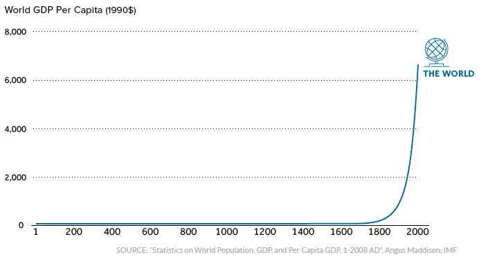
For thousands of years, economic progress was largely linear and linked to population growth. Without machines or technological innovations, one person could only produce so much with their time and resources.
More recently, innovations in technology and energy allowed the “hockey stick” effect to come into play.
It happened in Western Europe and North America first, and now it’s happening in other parts of the world. As this technological playing field evens, economies like China and India – traditionally some of the largest economies throughout history – are now making their big comeback.
Editor’s note: We have adjusted the main graphic as of Sep 10, 2017 to change the description of the chart. It now says “Share of GDP (World Powers)” instead of the previous “Share of world GDP”, which was technically an inaccurate description.


Markets
U.S. Debt Interest Payments Reach $1 Trillion
U.S. debt interest payments have surged past the $1 trillion dollar mark, amid high interest rates and an ever-expanding debt burden.


U.S. Debt Interest Payments Reach $1 Trillion
This was originally posted on our Voronoi app. Download the app for free on iOS or Android and discover incredible data-driven charts from a variety of trusted sources.
The cost of paying for America’s national debt crossed the $1 trillion dollar mark in 2023, driven by high interest rates and a record $34 trillion mountain of debt.
Over the last decade, U.S. debt interest payments have more than doubled amid vast government spending during the pandemic crisis. As debt payments continue to soar, the Congressional Budget Office (CBO) reported that debt servicing costs surpassed defense spending for the first time ever this year.
This graphic shows the sharp rise in U.S. debt payments, based on data from the Federal Reserve.
A $1 Trillion Interest Bill, and Growing
Below, we show how U.S. debt interest payments have risen at a faster pace than at another time in modern history:
| Date | Interest Payments | U.S. National Debt |
|---|---|---|
| 2023 | $1.0T | $34.0T |
| 2022 | $830B | $31.4T |
| 2021 | $612B | $29.6T |
| 2020 | $518B | $27.7T |
| 2019 | $564B | $23.2T |
| 2018 | $571B | $22.0T |
| 2017 | $493B | $20.5T |
| 2016 | $460B | $20.0T |
| 2015 | $435B | $18.9T |
| 2014 | $442B | $18.1T |
| 2013 | $425B | $17.2T |
| 2012 | $417B | $16.4T |
| 2011 | $433B | $15.2T |
| 2010 | $400B | $14.0T |
| 2009 | $354B | $12.3T |
| 2008 | $380B | $10.7T |
| 2007 | $414B | $9.2T |
| 2006 | $387B | $8.7T |
| 2005 | $355B | $8.2T |
| 2004 | $318B | $7.6T |
| 2003 | $294B | $7.0T |
| 2002 | $298B | $6.4T |
| 2001 | $318B | $5.9T |
| 2000 | $353B | $5.7T |
| 1999 | $353B | $5.8T |
| 1998 | $360B | $5.6T |
| 1997 | $368B | $5.5T |
| 1996 | $362B | $5.3T |
| 1995 | $357B | $5.0T |
| 1994 | $334B | $4.8T |
| 1993 | $311B | $4.5T |
| 1992 | $306B | $4.2T |
| 1991 | $308B | $3.8T |
| 1990 | $298B | $3.4T |
| 1989 | $275B | $3.0T |
| 1988 | $254B | $2.7T |
| 1987 | $240B | $2.4T |
| 1986 | $225B | $2.2T |
| 1985 | $219B | $1.9T |
| 1984 | $205B | $1.7T |
| 1983 | $176B | $1.4T |
| 1982 | $157B | $1.2T |
| 1981 | $142B | $1.0T |
| 1980 | $113B | $930.2B |
| 1979 | $96B | $845.1B |
| 1978 | $84B | $789.2B |
| 1977 | $69B | $718.9B |
| 1976 | $61B | $653.5B |
| 1975 | $55B | $576.6B |
| 1974 | $50B | $492.7B |
| 1973 | $45B | $469.1B |
| 1972 | $39B | $448.5B |
| 1971 | $36B | $424.1B |
| 1970 | $35B | $389.2B |
| 1969 | $30B | $368.2B |
| 1968 | $25B | $358.0B |
| 1967 | $23B | $344.7B |
| 1966 | $21B | $329.3B |
Interest payments represent seasonally adjusted annual rate at the end of Q4.
At current rates, the U.S. national debt is growing by a remarkable $1 trillion about every 100 days, equal to roughly $3.6 trillion per year.
As the national debt has ballooned, debt payments even exceeded Medicaid outlays in 2023—one of the government’s largest expenditures. On average, the U.S. spent more than $2 billion per day on interest costs last year. Going further, the U.S. government is projected to spend a historic $12.4 trillion on interest payments over the next decade, averaging about $37,100 per American.
Exacerbating matters is that the U.S. is running a steep deficit, which stood at $1.1 trillion for the first six months of fiscal 2024. This has accelerated due to the 43% increase in debt servicing costs along with a $31 billion dollar increase in defense spending from a year earlier. Additionally, a $30 billion increase in funding for the Federal Deposit Insurance Corporation in light of the regional banking crisis last year was a major contributor to the deficit increase.
Overall, the CBO forecasts that roughly 75% of the federal deficit’s increase will be due to interest costs by 2034.

-

 Maps2 weeks ago
Mapped: Average Wages Across Europe
-

 Money1 week ago
Which States Have the Highest Minimum Wage in America?
-

 Real Estate1 week ago
Ranked: The Most Valuable Housing Markets in America
-

 Markets1 week ago
Charted: Big Four Market Share by S&P 500 Audits
-

 AI1 week ago
The Stock Performance of U.S. Chipmakers So Far in 2024
-

 Automotive1 week ago
Almost Every EV Stock is Down After Q1 2024
-

 Money2 weeks ago
Where Does One U.S. Tax Dollar Go?
-

 Green2 weeks ago
Ranked: Top Countries by Total Forest Loss Since 2001