Misc
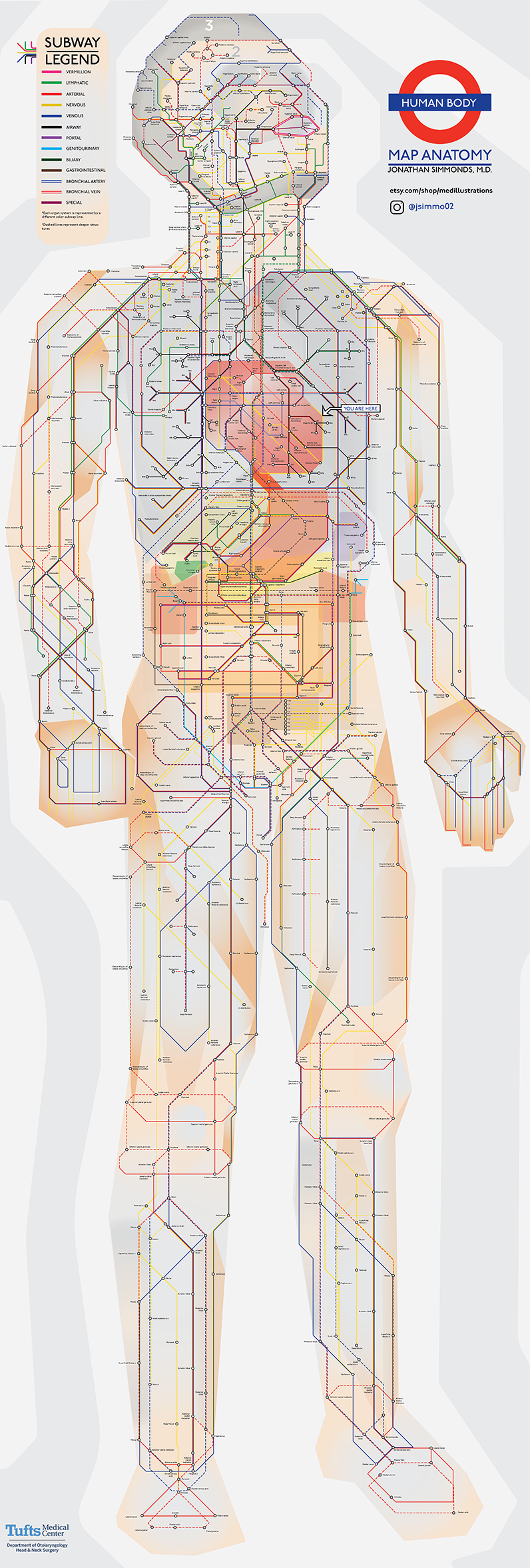
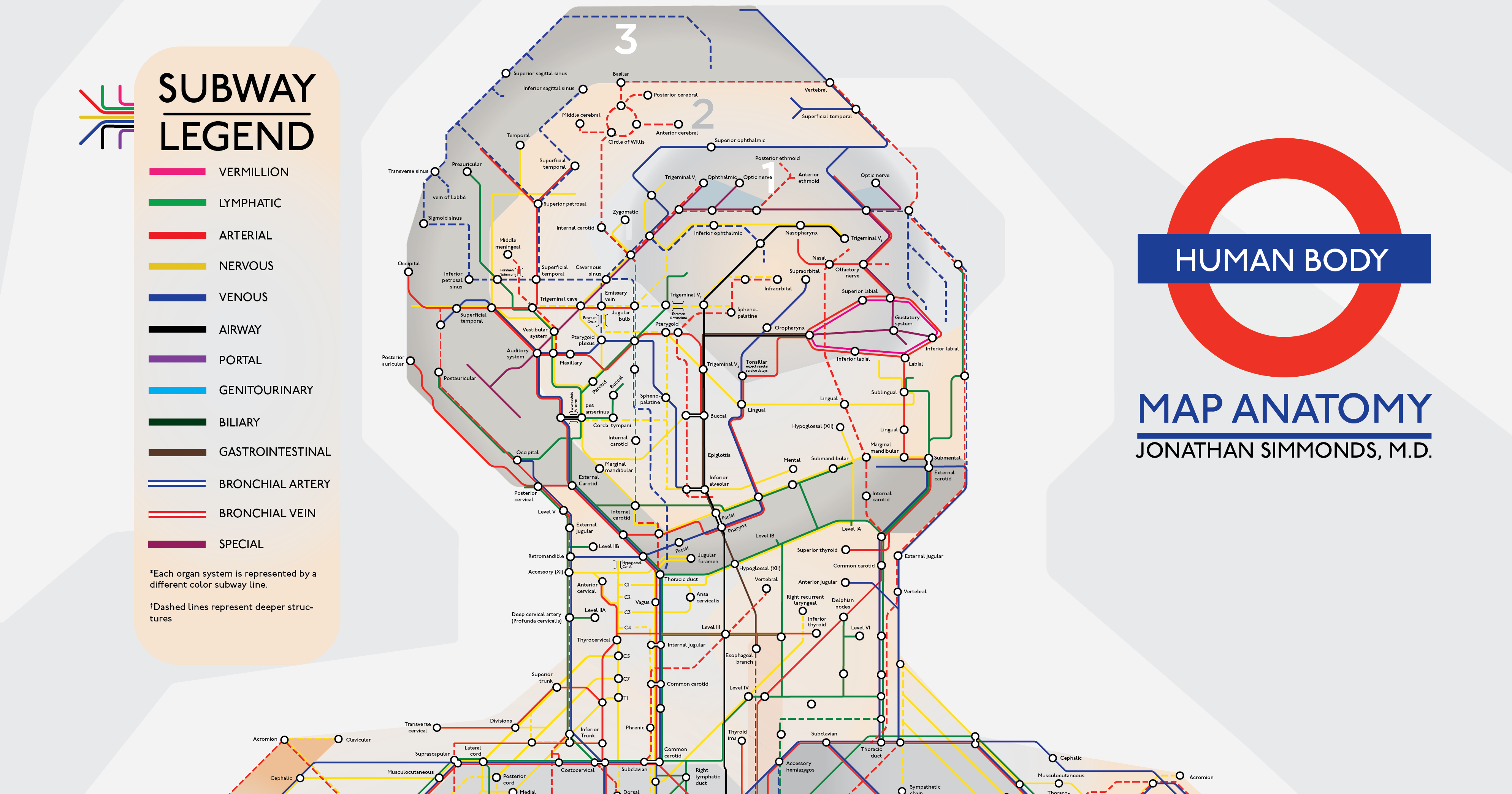
An Illustrated Subway Map of Human Anatomy
What comes to mind when you think about your body?
Most people might imagine an intricate network of blood vessels or the complex neural circuits of the brain. Or we might picture diagrams from the iconic medical textbook, Gray’s Anatomy.
Today’s visualization puts a unique spin on all of these ideas – interpreting human anatomy in the style of London’s transit system. Created by Jonathan Simmonds M.D., a resident physician at Tufts Medical Center, it’s a simple yet beautifully intuitive demonstration of how efficiently our bodies work.
View a high resolution version of this graphic.
Make sure to view the full resolution version of this intricate visualization.
From Point A to Point Z
Right away, we can see that each system is broken down into a few major colored ‘lines’. Here are a few:
- Vermillion system (Pink line)
This covers one of the smallest surface areas, namely the boundary around the mouth from the cupid’s bow to the bottom lip. - Airway system (Black line)
This represents the sections from the nose and mouth, down the windpipe and into the lungs. The system also works with bronchial arteries and veins – the striped blue and red lines respectively. - Nervous system (Yellow line)
This starts from the temporal lobe of the brain, and reaches all the way to the body’s extremities, such as the fingertips and feet. - Portal system (Purple line)
Approximately 75% of blood flowing from the liver passes through portal veins, which are one of two sets of veins connected to the liver. - Special system (Magenta line)
This includes organs responsible for four of the five traditional senses – sight, hearing, smell, and taste – as well the reproductive organs.
While dashed lines represent deeper structures, sections with ‘transfers’ show where different organ systems intersect. The head is also helpfully categorized into three ‘zones’.
Of course, it’s not as straightforward as starting in one place and ending up on the opposite end – as with city transit systems, there are multiple routes that can be taken. If you’re still daunted by where to start with this map of human anatomy, there’s a helpful “You Are Here” at the heart.
To counter common biases in the medical field, Dr. Simmonds has noted that he will soon update the illustration to include racialized and female versions.
An Enduring Symbol
From a broader design perspective, this anatomical subway map draws inspiration from the famous London Underground design.
When engineering draftsman Harry Beck debuted this map back in the 1930s, it caused quite a stir. Many argued that it wasn’t geographically accurate, and that its scale was wildly skewed.
But that didn’t matter to most commuters. Beck’s map offered something that no one else did – it combined all the different lines into one pocket-sized diagram.
Beck’s map was revolutionary in its simplicity.
– Sam Mullins, London Transport Museum Director
As a result, the Tube’s linear, color-coded aesthetic is arguably the most recognizable transit map in the world today. Many major cities hopped on board with the timeless new look, such as Sydney and Paris.
This iconic subway map design has been used as a visual reference for everything from Ancient Roman roads to the Milky Way. That’s what makes it such a good application for the most complex network of all – the human body.


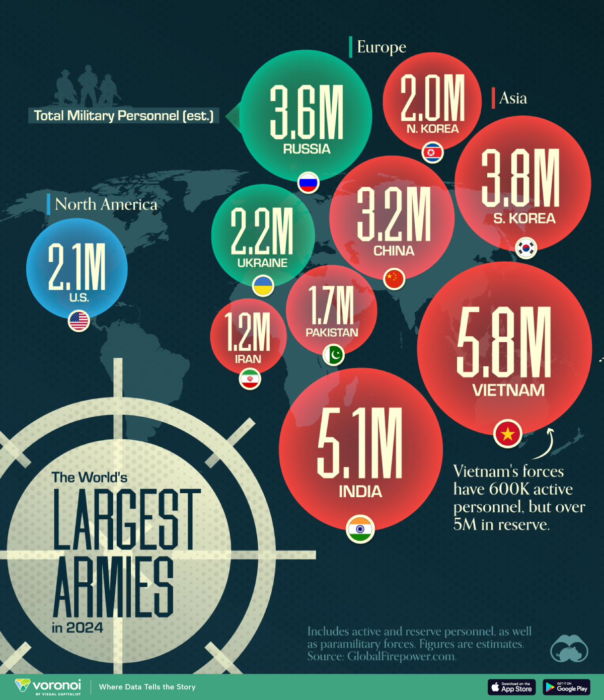
Mapped: The World’s Largest Armies in 2024
This was originally posted on our Voronoi app. Download the app for free on iOS or Android and discover incredible data-driven charts from a variety of trusted sources.
Despite being considered the biggest military force in the world, the United States doesn’t have the largest army in terms of personnel.
This graphic shows the top 10 countries by military personnel as of May 2024, including active and reserve personnel, as well as paramilitary forces. It is based on estimates from GlobalFirepower.com.
Vietnam, India, and South Korea Have the Biggest Armies
China has the largest standing army, with over 2 million active personnel. With increasing defense spending over the last decades, the country also ranks third in the number of tanks and second in the number of aircraft carriers in service.
When reserve personnel are included, however, the Chinese military falls behind those of Vietnam, India, South Korea, and Russia.
Vietnam’s forces include 600,000 active personnel and over 5 million in reserve. This is because Vietnam, along with countries like South Korea and Israel, has a standing policy of conscription for young adults.
| Country | Total Military Personnel (est.) | Region |
|---|---|---|
| 🇻🇳 Vietnam | 5.8M | Asia |
| 🇮🇳 India | 5.1M | Asia |
| 🇰🇷 South Korea | 3.8M | Asia |
| 🇷🇺 Russia | 3.6M | Europe/Asia |
| 🇨🇳 China | 3.2M | Asia |
| 🇺🇦 Ukraine | 2.2M | Europe |
| 🇺🇸 United States | 2.1M | North America |
| 🇰🇵 North Korea | 2.0M | Asia |
| 🇵🇰 Pakistan | 1.7M | Asia |
| 🇮🇷 Iran | 1.2M | Middle East |
Interestingly, the 2022 Russian invasion of Ukraine resulted in a massive increase in Ukrainian personnel numbers. Active personnel rose from around 170,000 in 2016 to over 900,000.
Despite not having the largest army, the U.S. accounts for almost 40% of global military expenditures, with its 2022 spending totaling $877 billion.
China ranked second in absolute terms, accounting for another 13% of world military expenditure at $292 billion.

-

 Maps7 days ago
Map: Where Are America’s Largest Landfills?
-

 Finance2 weeks ago
Ranked: The World’s 50 Largest Private Equity Firms
-

 Markets2 weeks ago
Mapped: The 10 U.S. States With the Lowest Real GDP Growth
-

 Economy2 weeks ago
Comparing New and Current U.S. Tariffs on Chinese Imports
-
 China2 weeks ago
Which Countries Have the Most Economic Influence in Southeast Asia?
-

 United States2 weeks ago
The Top 25 Nationalities of U.S. Immigrants
-

 Countries2 weeks ago
Ranked: Countries Where Youth are the Most Unhappy, Relative to Older Generations
-

 Technology2 weeks ago
Visualizing the 5 Most Common Cybersecurity Mistakes