Environment
Visualizing Global Per Capita CO2 Emissions
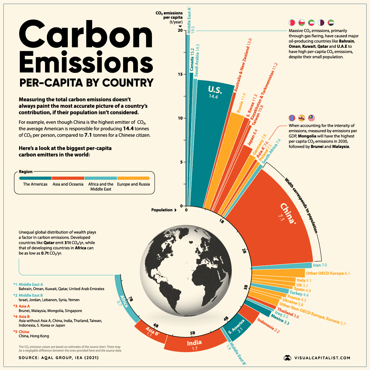


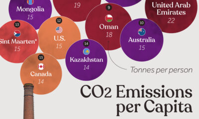
Highest Per Capita CO2 Emissions
Developing countries like China, India, and Russia are some of the highest producers of CO2 worldwide and will be so for a while. But the situation is far from straightforward—and looking at CO2 emissions per capita can add nuance to the overall story.
Based on data presented by the Aqal Group and the IEA, here we visualize the countries and regions with the highest per capita carbon emissions from around the world.
Let’s dive into the highest per capita carbon emitters and how they are trying to reduce their carbon contributions.
Leaders in Per Capita CO2 Emissions
Oil-producing countries in the Middle East are the highest emitters of CO2 on a per capita basis, but developed countries like the U.S., Australia, New Zealand, and Canada also have some of the higher rates of per capita emissions.
| Rank | Country or Region | Carbon Emissions Per Capita (t/year) |
|---|---|---|
| #1 | Middle East A* | 19.5 |
| #2 | Canada | 15.2 |
| #3 | Saudi Arabia | 14.5 |
| #4 | United States | 14.4 |
| #5 | Australia & New Zealand | 13.6 |
| #6 | Russia | 11.4 |
| #7 | South Korea | 11.3 |
| #8 | Kazakhstan & Turkmenistan | 11.2 |
| #9 | Taiwan | 10.8 |
| #10 | Japan | 8.4 |
| Global Average | 4.4 |
*Middle East A group includes Bahrain, Oman, Kuwait, Qatar, and United Arab Emirates
Canada and the United States have per capita carbon footprints of 15.2 and 14.4 tonnes per year, respectively. Meanwhile, Australia and New Zealand combine for an average per capita footprint of over 13.6 tonnes per year.
It’s worth noting that all of these numbers are more than three times higher than the global average, which in 2019 was 4.4 tonnes per person.
Energy Sources and Per Capita CO2 Emissions
Since there is a strong relationship between wealth and per capita CO2 emissions, we’d expect countries with high living standards to have a high carbon footprint.
But the data above shows significant differences in per capita emissions, even between countries with similar living standards. Many countries across Europe, for example, have much lower emissions than the U.S., Canada, or Australia.
Here’s a look at the top 25 countries by standard of living and their share of electricity production from fossil fuels:
| Rank | Country | Per Capita Electricity Consumption (kWh) | % Electricity Production (from fossil fuels) |
|---|---|---|---|
| 1 | 🇫🇮 Finland | 12,174 | 15.6% |
| 2 | 🇩🇰 Denmark | 5,015 | 21.8% |
| 3 | 🇳🇴 Norway | 26,492 | 1.2% |
| 4 | 🇧🇪 Belgium | 7,414 | 34.6% |
| 5 | 🇸🇪 Sweden | 16,478 | 2.2% |
| 6 | 🇨🇭 Switzerland | 7,935 | 1.0% |
| 7 | 🇳🇱 Netherlands | 7,264 | 71.5% |
| 8 | 🇫🇷 France | 8,097 | 9.5% |
| 9 | 🇩🇪 Germany | 6,771 | 43.8% |
| 10 | 🇯🇵 Japan | 7,446 | 69.1% |
| 11 | 🇬🇧 United Kingdom | 4,500 | 40.7% |
| 12 | 🇨🇦 Canada | 16,648 | 16.6% |
| 13 | 🇰🇷 South Korea | 10,458 | 65.8% |
| 14 | 🇺🇸 United States | 12,235 | 60.1% |
| 15 | 🇹🇼 Taiwan | 11,091 | 82.8% |
| 16 | 🇦🇹 Austria | 7,716 | 20.7% |
| 17 | 🇦🇺 Australia | 9,857 | 75.1% |
| 18 | 🇮🇪 Ireland | 6,408 | 59.3% |
| 19 | 🇸🇬 Singapore | 8,542 | 96.7% |
| 20 | 🇪🇸 Spain | 5,641 | 34.4% |
| 21 | 🇮🇹 Italy | 4,554 | 56.8% |
| 22 | 🇨🇿 Czech Republic | 7,534 | 50.7% |
| 23 | 🇵🇹 Portugal | 5,100 | 41.2% |
| 24 | 🇳🇿 New Zealand | 8,880 | 18.9% |
| 25 | 🇱🇺 Luxembourg | 1,529 | 28.5% |
Sources: Electricity consumption, Fossil fuel mix
The choice of energy sources plays a key role here. In the UK, Portugal, and France, a much higher share of electricity is produced from nuclear and renewable sources.
For example, only 9.5% of France’s electricity production comes from fossil fuels, compared to other developed countries like the U.S. at 60.1% and Japan at 69.1%.
G20 Countries and Carbon Emissions
This reliance on fossil fuels for energy production extends to the rest of the G20 countries. According to the Climate Transparency Report, CO2 emissions will rise by 4% across the G20 group this year, dropping 6% in 2020 due to the pandemic.
This rise is mainly due to the increase in coal consumption across these countries. Coal consumption is projected to rise by almost 5% in 2021, with this growth driven by China (accounting for 61% of the growth), the U.S. (18%), and India (17%).
Here’s a look at the current coal power capacity of each G20 country:
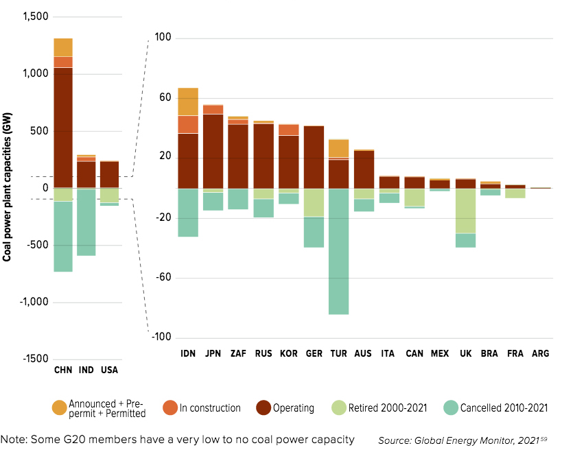
Coal use in China has surged, with the country experiencing increased demand for energy as the global economy has recovered. Coal prices are up nearly 200% from a year ago.
Plans to Tackle Emissions
The conclusion of the U.N. Climate Change Conference (COP26) in Glasgow saw several pledges and announcements being made by various countries. Here are some of the highlights:
- The world’s biggest CO2 emitters, the U.S. and China, pledged to cooperate more over the next decade in areas including methane emissions and the switch to clean energy.
- Leaders from more than 100 countries—with about 85% of the world’s forests—promised to stop deforestation by 2030.
- More than 100 countries agreed upon a scheme to cut 30% of methane emissions by 2030.
- Financial organizations have agreed to back renewable energy and direct finance away from fossil fuel-burning industries.
Many countries have pledged to do their part to tackle climate change. It will be an impressive display of global unity if global CO2 emissions drop significantly over the next decade.


Environment
The Rise in America’s Billion-Dollar Extreme Weather Disasters
From tropical cyclones to severe storms, the number of extreme weather disasters with losses exceeding $1 billion has climbed over time.
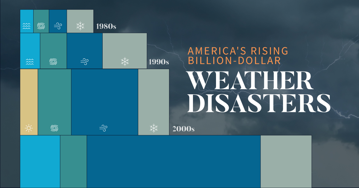
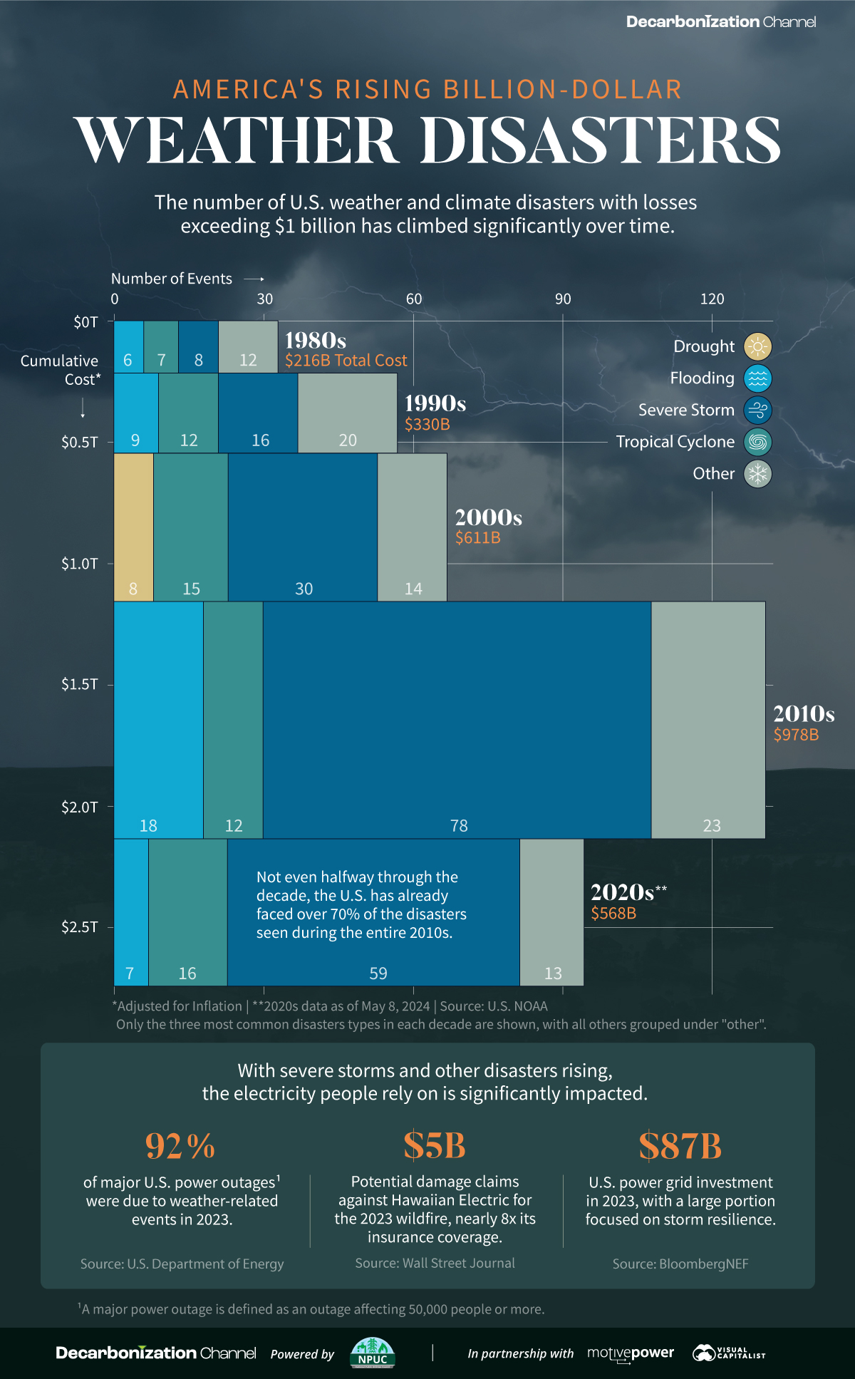
The Rise in U.S. Billion-Dollar Extreme Weather Disasters
Since 1980, there have been 383 extreme weather or climate disasters where the damages reached at least $1 billion. In total, these disasters have cost more than $2.7 trillion.
Created in partnership with the National Public Utilities Council, this chart shows how these disasters have been increasing with each passing decade.
A Growing Concern
The U.S. National Oceanic and Atmospheric Administration (NOAA) tracks each disaster and estimates the cost based on factors like physical damages and time losses such as business interruption. They adjust all costs by the Consumer Price Index to account for inflation.
| Decade | Total No. of Events | Total Inflation-Adjusted Cost |
|---|---|---|
| 1980s | 33 | $216B |
| 1990s | 57 | $330B |
| 2000s | 67 | $611B |
| 2010s | 131 | $978B |
| 2020s* | 95 | $568B |
* Data is as of May 8, 2024.
Both the number and cost of extreme weather disasters has grown over time. In fact, not even halfway through the 2020s the number of disasters is over 70% of those seen during the entire 2010s.
Severe storms have been the most common, accounting for half of all billion-dollar disasters since 1980. In terms of costs, tropical cyclones have caused the lion’s share—more than 50% of the total. Hurricane Katrina, which made landfall in 2005, remains the most expensive single event with $199 billion in inflation-adjusted costs.
Electricity and Extreme Weather Disasters
With severe storms and other disasters rising, the electricity people rely on is significantly impacted. For instance, droughts have been associated with a decline in hydropower, which is an important source of U.S. renewable electricity generation.
Disasters can also lead to significant costs for utility companies. Hawaii Electric faces $5 billion in potential damages claims for the 2023 wildfire, which is nearly eight times its insurance coverage. Lawsuits accuse the company of negligence in maintaining its infrastructure, such as failing to strengthen power poles to withstand high winds.
Given that the utilities industry is facing the highest risk from extreme weather and climate disasters, some companies have begun to prepare for such events. This means taking steps like burying power lines, increasing insurance coverage, and upgrading infrastructure.
Learn how the National Public Utilities Council is working toward the future of sustainable electricity.

-

 Environment2 months ago
Ranked: Top Countries by Total Forest Loss Since 2001
The country with the most forest loss since 2001 lost as much forest cover as the next four countries combined.
-
 Environment4 months ago
Charted: Share of World Forests by Country
We visualize which countries have the biggest share of world forests by area—and while country size plays a factor, so too, does the environment.
-
 Environment4 months ago
Which Countries Have the Largest Forests?
Together, the top five countries with the largest forests account for more than half of the world’s entire forest cover.
-

 Environment5 months ago
Visualized: What Lives in Your Gut Microbiome?
The human gut microbiome contains a world of microbes. We look at the the bacteria that deeply affect our health and well-being.
-
 Environment6 months ago
Mapped: Global Temperature Rise by Country (2022-2100P)
In this set of three maps, we show the global temperature rise on a national level for 2022, 2050, and 2100 based on an analysis by…
-
 Environment6 months ago
Ranked: Per Capita Carbon Emissions by Country
Which countries rank the highest in per capita carbon emissions, and how do they impact the world’s total carbon emissions?

-

 Maps7 days ago
Map: Where Are America’s Largest Landfills?
-

 Finance2 weeks ago
Ranked: The World’s 50 Largest Private Equity Firms
-
 Markets2 weeks ago
Mapped: The 10 U.S. States With the Lowest Real GDP Growth
-
 Economy2 weeks ago
Comparing New and Current U.S. Tariffs on Chinese Imports
-
 China2 weeks ago
Which Countries Have the Most Economic Influence in Southeast Asia?
-
 United States2 weeks ago
The Top 25 Nationalities of U.S. Immigrants
-

 Countries2 weeks ago
Ranked: Countries Where Youth are the Most Unhappy, Relative to Older Generations
-

 Technology2 weeks ago
Visualizing the 5 Most Common Cybersecurity Mistakes